
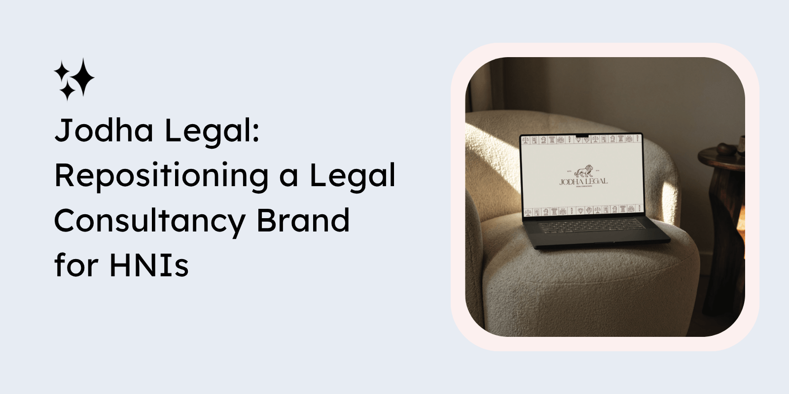
Jodha Legal approached us at a stage where the business had already built operational credibility and years of experience within the UAE legal ecosystem. However, while the firm’s expertise and clientele reflected a premium advisory positioning, the brand itself did not fully communicate that perception.
The challenge was not a lack of capability; it was a gap between the level of clientele the firm served and how the business visually and strategically presented itself. As a legal consultancy working with high-net-worth individuals and sophisticated clients in the UAE, the brand needed to feel more refined, intentional, and aligned with the expectations of an audience that values trust, discretion, sophistication, and long-term advisory relationships.
Our objective was therefore not simply to “modernize” the brand, but to reposition Jodha Legal in a way that elevated perception while still preserving credibility and professionalism. The final direction focused on creating a brand identity that felt timeless, confident, premium, and quietly authoritative rather than loud or aggressively corporate.
Key Highlights
- UAE-based legal consultancy serving high-net-worth clientele
- Existing business with strong operational credibility
- Need for strategic repositioning and elevated brand perception
- Focus on premium yet understated visual identity
- Branding designed to better align with sophisticated target audiences
About the Client
Jodha Legal is a UAE-based legal consultancy providing advisory and legal services to discerning clients, including high-net-worth individuals and businesses requiring trusted legal guidance.
The firm had already established itself operationally, but the existing branding lacked the sophistication and consistency required to reflect the caliber of services being delivered. The visual identity needed to move beyond a functional legal aesthetic and instead communicate confidence, discretion, trust, and premium positioning in a more intentional manner.
The founders also wanted the brand to stand apart from traditional legal firms that often rely heavily on outdated visual systems or overly aggressive corporate imagery. The objective was to create a more refined and contemporary identity while maintaining the seriousness and authority expected from a legal consultancy.
Key Highlights
- Legal consultancy operating within the UAE market
- Audience included HNIs and premium clientele
- Existing branding lacked alignment with service positioning
- Required a more contemporary and elevated identity
- Goal was to balance authority with sophistication
The Vision
From the beginning, the vision for the rebrand centered around creating a legal brand that felt quietly powerful rather than overtly corporate. The identity needed to convey strategic confidence, precision, and trust without relying on visual clichés commonly associated with the legal sector.
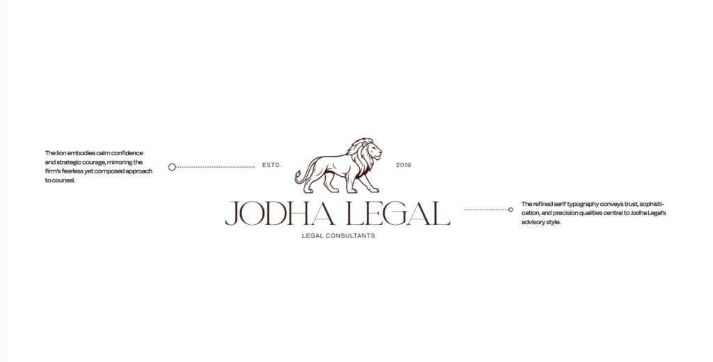
One of the strongest symbolic directions explored during the project was the lion motif, which ultimately became central to the identity system. The lion represented calm confidence, strategic courage, and composed authority; qualities that mirrored the firm’s advisory approach and relationship-driven service model.
The broader visual and verbal direction focused on ensuring the brand appealed to a more premium segment of the UAE market while remaining timeless and credible. Instead of appearing intimidating or transactional, the identity was designed to feel measured, intelligent, and deeply intentional.
Key Highlights
- Positioning centered around quiet confidence and authority
- Branding designed to appeal to sophisticated UAE clientele
- Lion motif used to symbolize strategic courage and trust
- Focus on timelessness over trend-driven legal branding
- Identity designed to feel refined rather than overly corporate
Our Branding Process
The first phase of the engagement focused on understanding how Jodha Legal wanted to be perceived within the market and where the disconnect existed between operational reality and external brand perception.
Through our discovery and positioning discussions, it became evident that the firm required more than a visual refresh. The business needed a cohesive identity system capable of supporting:
- premium client acquisition,
- stronger market positioning,
- and long-term brand consistency across touchpoints.
We explored multiple visual territories before arriving at a direction that balanced sophistication with restraint. The final identity system intentionally avoided loud legal symbolism and instead leaned into understated elegance, strategic typography, and premium editorial-inspired layouts.
The process also involved thinking beyond the logo itself and creating a full ecosystem that could extend seamlessly across:
- digital platforms,
- stationery,
- social media,
- presentations,
- and future brand applications.
Key Highlights
- Discovery sessions focused on perception and positioning gaps
- Strategic repositioning beyond visual redesign alone
- Premium editorial-inspired creative direction explored
- Identity system designed for long-term scalability
- Branding developed for both digital and physical touchpoints
Visual Identity Development
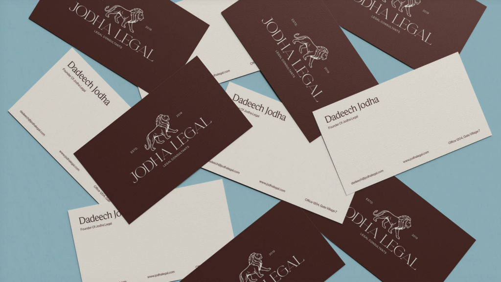
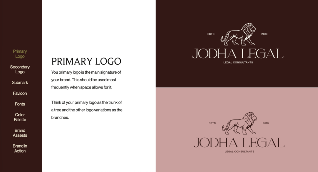
The visual identity system for Jodha Legal was built around restraint, elegance, and quiet authority. The primary logo featured refined serif typography paired with the lion symbol, creating a visual language that felt both premium and trustworthy.
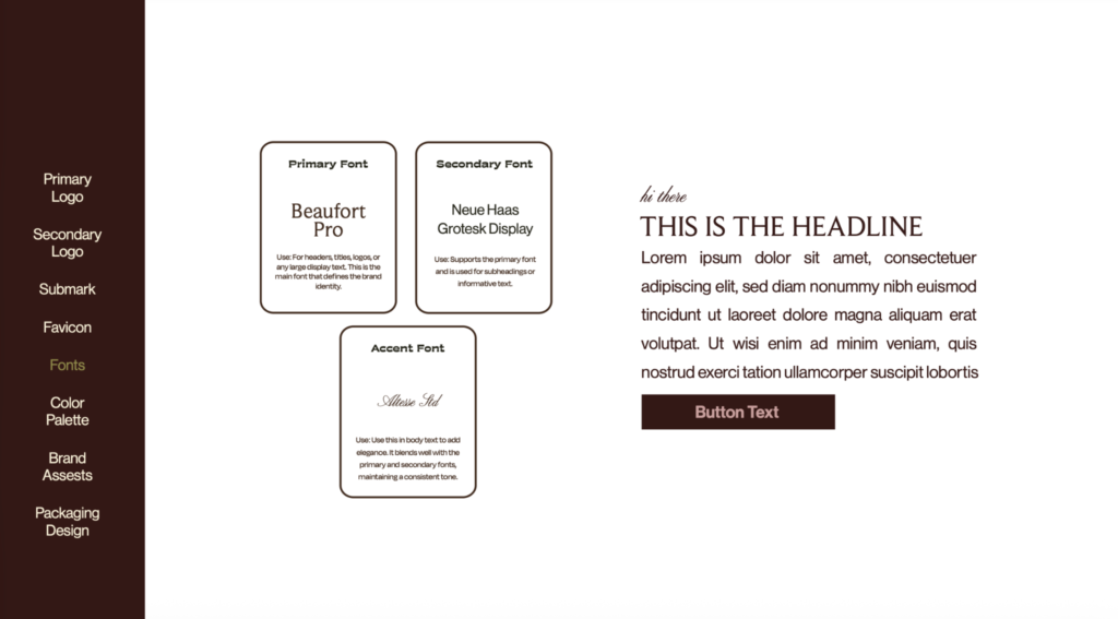
Typography selection played a significant role in shaping the brand perception. The use of Beaufort Pro as the primary typeface introduced a sense of sophistication and timelessness, while Neue Haas Grotesk Display added structure and clarity for supporting communication. Together, the typography system balanced heritage-inspired elegance with modern professionalism.
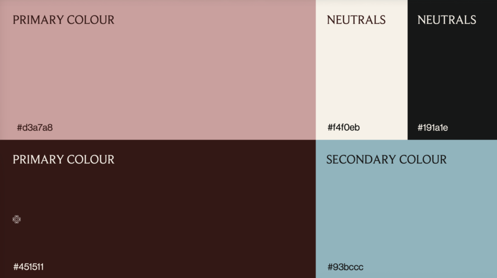
The color palette was intentionally designed to move away from predictable legal branding conventions. Instead of relying solely on black, navy, or grey, we developed a richer and more emotionally layered palette using burgundy, muted blush tones, warm neutrals, and soft blue accents. This gave the brand a distinctive visual identity while still maintaining professionalism and credibility.
The project also included the development of:
- primary and secondary logos,
- submarks,
- favicon systems,
- brand stationery,
- digital applications,
- and supporting iconography systems for future scalability.
Key Highlights
- Premium serif-led logo identity with lion symbolism
- Typography system balancing elegance and clarity
- Distinctive color palette beyond conventional legal branding
- Development of scalable logo variations and submarks
- Cohesive visual system across digital and physical assets
Brand Assets & Applications
An important part of the project involved ensuring the identity translated effectively across real-world applications. The branding system was therefore designed with flexibility and consistency in mind, allowing the firm to maintain a strong visual presence across both client-facing and internal touchpoints.
We developed multiple brand applications including:
- stationery systems,
- business cards,
- presentation layouts,
- social media branding,
- digital profile applications,
- packaging-inspired collateral,
- and embossed seal-inspired visual elements that reinforced sophistication and authority.
These applications helped move the brand from simply being a logo redesign into a complete premium identity ecosystem capable of supporting long-term business growth and stronger audience perception.
Key Highlights
- Branding extended across multiple real-world applications
- Premium stationery and presentation systems designed
- Social and digital branding applications included
- Embossed and seal-inspired elements reinforced trust and heritage
- Flexible system created for future brand consistency
The Outcome
The final rebrand gave Jodha Legal a far more aligned and sophisticated market presence, one that accurately reflected the level of clientele, expertise, and advisory experience the firm already possessed.
More importantly, the branding helped reposition the business away from generic legal consultancy aesthetics and toward a more premium, relationship-driven identity designed for high-net-worth and discerning clients within the UAE market.
The final system balanced:
- trust,
- sophistication,
- authority,
- and modernity,
For service-led businesses operating in premium categories, perception plays a significant role in trust and decision-making. This project demonstrated how strategic branding can help bridge the gap between operational excellence and market perception, especially in industries where credibility and discretion are critical.
Key Highlights
- Elevated perception aligned with premium clientele
- Stronger differentiation within the legal consultancy market
- Cohesive premium identity system developed
- Branding designed to support long-term credibility and growth
- Strategic repositioning tailored toward HNI audiences in the UAE
Looking to brand your services business? Reach out to our branding experts today.