
Color is one of the first things people notice about your brand, and this is why it matters. It influences first impressions, helps create an emotional connection, and plays a powerful role in brand memorability.
Brands that use color intentionally don’t just look good, they influence customers. Because the brain reacts to color before you read even a single word.
In this guide, we will dive into the power of color in branding and help you choose the right color palette for your brand.
Understanding Color Psychology in Branding
At its core, color psychology is about how your brain perceives different colors differently. That’s why, when you look at a health-oriented brand with a green color palette, it subconsciously makes you believe that the brand will deliver on its promise of health. This is color psychology doing its job.
Let’s look into the emotional and behavioral triggers of key colors:
Red
This color is associated with intensity and passion. It is urgent and therefore, widely used to grab attention in CTAs. It also increases your appetite making it a perfect choice for fast food brands. However, with passion and excitement, red also brings a sense of aggression and danger. It thrives best when used in the right context.
Blue
Blue brings up feelings of trust, calm, intelligence, and reliability. That’s why banks, hospitals, and tech companies use blue heavily in their color palettes. Because they deal with huge amounts of data, this color makes their brands seem trustworthy and competent in the eyes of their customers.
Yellow
This is the color of happiness, energy, clarity, and attention. Brands use yellow if they want to be seen as creative, optimistic, and youthful. McDonald’s makes great use of yellow in their visual identity. However, there is a need for balance when dealing with this color since too much of it can be overwhelming.
Green
Green represents nature, wellness, and balance. Brands use green to communicate their eco-conscious values. Darker hues of green can also hint at wealth.
Purple
Purple symbolizes luxury and exclusivity. Brands can use this color to signal a premium product or service. Depending on how it’s used, purple can evoke anything from creativity to spirituality.
Black/ White/ Grey
This trio stands for neutrality and minimalism. Black and white form a modern combination that’s foundational to many tech or luxury fashion brands. Common examples include brands like Apple, Chanel, and Nike.
However, a lot of people miss this one thing when choosing a color for their brands. Color isn’t universal. People interpret colors differently due to cultural influences. This might be troublesome for brands that have global aspirations. For instance, white is associated with purity in Western cultures, but in many Asian countries, it represents mourning.
And therefore, smart brands use color psychology to influence consumer behavior. Like Facebook’s blue stands for trust and reliability, and Coca-Cola’s red brings energy and urgency.
The Role of Color in Brand Perception and Identity
Whether your brand is bold, nurturing, elite or energetic, color often shapes how customers perceive it before they read a single word. It can communicate your story to your customers before they know what you do.
Think how luxury brands often use muted, minimalistic tones. Colors like black, navy, and gold feel premium and high-end. Now, compare that with mass-market brands that use bright, saturated tones to seem approachable and to stand out. These brands showcase different personalities and, therefore, are perceived differently by consumers.

Another example would be the shift towards earthy neutrals in clean beauty brands that signal safety and sustainability. Choosing an intentional color palette, therefore, tricks your brain into feeling what the brand wants you to feel.
How Color Affects Brand Recognition and Recall
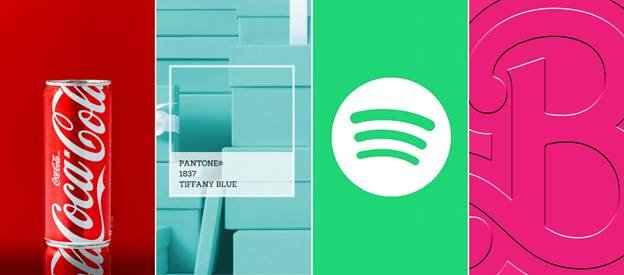
A study by the University of Loyola, Maryland, found that color can boost brand recognition by up to 80%. That’s why some of the most iconic brands can be identified just by their colors. You see a certain shade of red and you get reminded of Coca Cola.
Tiffany’s blue is instantly recognizable. That specific green instantly brings Spotify to mind. And, once dismissed as girly, Barbie’s pink has become a global symbol of fun and empowerment.
So, how does this work? The answer lies in neuroscience. The limbic system, responsible for memory and emotions, is the same part of the brain that processes color. When you consistently pair a color with a brand, your brain starts building an association. Over time, the color becomes a shorthand for the brand itself.
However, this type of recall doesn’t happen overnight. Your brand colors should appear consistently across all touchpoints – your website, your product packaging as well as your social media. The more people who see the color paired with your brand, the stronger the association becomes.
Building a Strategic Brand Color Palette
Choosing your brand colors isn’t about picking your favorites or following what’s trendy. It’s about building a color palette that aligns with your brand values and reflects what it stands for.
Where to start? Before diving into colors and accents, get clear on your:
- Target Audience
- Industry Landscape
- Brand Values
- Tone of Voice
It is important to know who you’re serving and how you want to make them feel. If you’re a tech-centric brand, your color palette will look very different from a luxury skincare line.
Therefore, once these are defined, you can start building a color palette that is structured but flexible.
The 3-Tier Palette Structure
Here is a simple structure we follow:
Primary Color
Your main color. It should dominate your brand visuals and reflect your core identity. Say, Spotify Green, McDonald’s Red, Barbie Pink. This builds recognition.
Secondary Colors
These support your primary color and add flexibility. Use them across different applications—web, packaging, social—without disrupting consistency.
Accent Colors
Used sparingly, these are for highlights, calls-to-action, or elements that need emphasis. They should contrast your primary color to stand out.
Palette Balancing Tips
A strong brand palette is more than just “pretty.” It’s strategic. Here are a few key rules:
Contrast vs. Harmony
A high-contrast palette can feel bold and energetic. Harmonious tones, on the other hand, feel calming. Choose what fits your brand vibe.
Cool vs. Warm Tones
Cool tones feel calming, professional, or fresh. Warm tones bring energy, passion, and urgency. A balance of both creates emotional range.
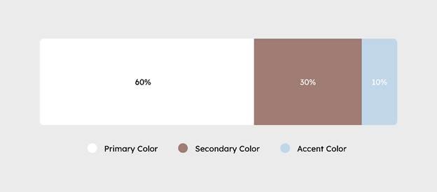
Dominance Ratios
Apply the 60-30-10 rule: 60% primary, 30% secondary, 10% accent colors. This keeps your visual identity balanced while avoiding visual clutter.
Your color palette should be inclusive. That means it should work for everyone, including people with visual impairment or color blindness. The WCAG (Web Content Accessibility Guidelines) recommend contrast ratios to ensure readability.
Here are a few tools that help with palette creation and testing:
- Coolors.co – Fast palette generation with contrast checking.
- Adobe Color – Lets you build harmonious palettes and test accessibility.
- Material.io – Google’s design tool for creating flexible, accessible color systems.
At the end of the day, your brand colors set the tone for what your customers should expect. When built strategically, your color palette becomes your brand itself.
Applying Brand Colors Across Touchpoints
Here’s how to apply these brand colors to ensure you deliver a consistent experience to the audience:
1. Logo & Visual Identity
Your logo is your brand’s first impression. Its color should reflect the core emotion you want people to feel.
- A great logo works in color, black and white, and inverse.
- Think whether it will hold up on print, packaging, or merchandise.
- Make sure it’s flexible enough for both light and dark modes.
2. Website & Digital Experience
On digital platforms, color guides the user journey.
- Use your primary and secondary colors to establish hierarchy and build trust.
- Accent colors should be used purposefully for CTAs, links, or hover states—not everywhere.
- Consider adaptability for light and dark mode browsing. Your colors need to stay readable in both.
3. Packaging & Product Design
Packaging is often the first physical interaction with your brand.
- Bold colors help your product stand out on shelves and make snap decisions easier.
- A thoughtful palette can improve the unboxing experience and influence perceived value.
- For sustainable brands, earthy tones, muted finishes, and textured elements establish authenticity.
4. Social Media
Your brand colors should be instantly recognizable across platforms.
- Build a visual grid using your color palette, even if the formats vary based on the platform (Instagram carousels, LinkedIn banners, Pinterest pins).
- Use brand colors in ad creatives, video overlays, and highlight covers.
5. Brand Environment (Physical Spaces, Events, Signage)
Colors carry over into real-world experiences too.
- In offices, retail stores, or booths, your color palette helps shape ambiance and mood.
- Use brand colors in furniture, signage, uniforms, and wayfinding elements.
Consistency across customer touchpoints builds recognition where every touchpoint reinforces what your brand stands for.
Color Trends vs. Timeless Strategy
Every year, new color trends emerge, Pantone’s Color of the Year being the biggest of them. It sets the tone for visual culture across industries.
For brand strategists, adding a trendy color to your palette can help your brand feel current. It can bring freshness and generate engagement, especially on platforms like Instagram and Pinterest that rely on visual appeal.
But over time, trends fade. If your brand identity keeps changing with trends, you risk losing consistency, and your visuals will often feel dated.
The solution? Instead of changing your entire palette, incorporate trend colors into seasonal campaigns while keeping your core brand colors consistent. This keeps your brand culturally relevant without any loss of identity.
Take Pantone Color of the Year 2025, Mocha Mousse, for instance. It may be perfect to layer in the color for a short burst, say, a winter campaign that captures the warmth and calmness the color brings.
Choosing the Right Color for Your Brand: A Strategic Framework
Picking a color palette can be tough. This is how we recommend strategically picking one:
1. Audit your current identity and audience perception
Before picking a color, evaluate your current brand palette. Ask yourself, what does it communicate about your identity. Does it align with your customer’s perception of your brand? This is where you use customer feedback to understand what people associate your brand with. This will help you get your basics clear and will serve as the foundation that will guide your next decisions.
2. Map your brand archetype to suitable color profiles
Brand archetypes are symbolic representations of a brand. They offer an easy way to align your brand identity to the emotions you want to evoke. For instance, if your brand is an Explorer driven by freedom, muted, earthy tones of blue and green would be ideal. Or if your brand is a Creator representing innovation, bolder and brighter colors would work best. This can not only guide your color choices, it also ensures that your brand emotionally resonates with your audience.
3. Conduct competitor analysis: stand out without confusing customers
It is important to study your competitors to understand patterns in your industry. Before choosing your brand colors, you need to know what works and what’s overused. Staying relevant in your industry means if every brand in your niche uses blue, to differentiate yourself, you can pick a complementary color that doesn’t betray your customer’s expectations.
4. Consider tone of voice
Your brand’s tone should guide your color decisions, whether it is serious or playful, bold or subtle. Your brand’s serious tone would be best supported by deep, grounded colors, whereas bright hues would suit brands with a playful tone of voice. Your brand colors should align with your brand voice and copy to eliminate dissonance in the minds of your customers.
5. A/B testing color variations in real assets to validate choices
Even if your color choices look perfect in theory, it is always imperative to test them out in real world settings. Try A/B testing different color variations on live assets such as landing pages or ad creatives to see how people react. This is a great way to go beyond guesswork and make data-backed decisions.
Brand Color Mistakes to Avoid
Here are some mistakes we recommend avoiding:
- Choosing colors based on personal preferences – Your favorite color isn’t your brand strategy. Effective palettes are intentional. They are built on audience insight rather than personal taste.
- Inconsistent color usage across media – A color that looks different on your website and Instagram weakens brand recall. Use consistent color codes across all platforms.
- Ignoring print vs. digital translation – Colors shift between screens and print. Always test how your palette translates to avoid mismatched color tones across different mediums.
- Poor accessibility contrast – Low contrast may look aesthetic, but it can hinder readability and accessibility. Ensure your text meets contrast standards for all users.
- Overloading with too many tones – Too many colors confuse your audience and dilute identity. Make sure you stick to a focused palette.
How The Brand Strategy Lab Builds Brand Color Systems
At The Brand Strategy Lab, we start with identifying your brand’s personality, positioning, and emotional intent. Our research-led approach ensures that your colors align with what your brand stands for and who it serves.
From there, we collaboratively create an intentional color palette in accordance with your business goals, and ensure consistent implementation across all touchpoints.
We’ve helped emerging brands create real world impact with color-led strategy. For brands like PayBy, a fintech startup, and She Can Hustle, a platform dedicated to empowering women entrepreneurs, we used color to stand out in a saturated market.

Final Thoughts
Color is more than decoration—it’s one of the most powerful tools in branding. When used strategically, color can build recognition, trigger emotion, and drive conversion.
Want to build a brand that not only looks good but also feels right to your audience? Let The Brand Strategy Lab help you define a color story that works.