Branding never really sits still, does it?
One year, a style feels fresh, and the next it’s already being reimagined. You’ve probably felt that shift yourself; logos seem lighter, colors feel more intentional, and brands are finding new ways to show up that go beyond what we’ve all been used to.
As we move toward 2026, the way companies express their identity is changing. Some of it’s driven by technology. Some of it comes from what people expect from the brands they trust. And some of it is simply the natural push toward cleaner, more thoughtful experiences.
In this post, we’ll walk through the branding trends that are likely to shape 2026 and highlight a few brands already leaning into these changes.
Key Branding Trends to Watch in 2026
Here are the key branding trends we expect to take the lead in 2026:
1. Minimalist, Adaptive Visual Identities
One clear shift heading into 2026 is the move toward minimalist, adaptive identities. Instead of relying on a single rigid logo or a heavy design style, brands are leaning into systems that stay clean, simple, and easy to adjust across any platform.
That means:
- Logos that still look sharp at the smallest screen size
- Color palettes that stay tight but flexible
- Layouts and components that can change fast without losing the brand’s feel
Apple has been doing this for years. The logo is as simple as it gets, yet it works everywhere, on packaging, product shells, event keynotes, store signage, and tiny digital surfaces.
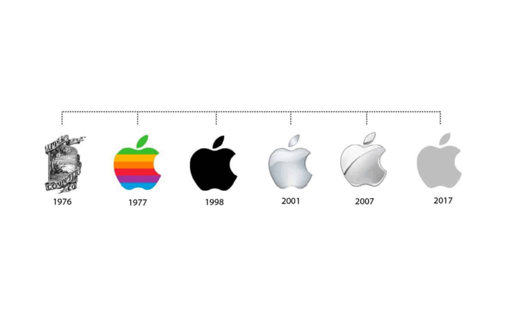
What makes Apple stand out is how easily the rest of its system adapts. The brand can switch from stark black-and-white to bold, colorful product campaigns without ever drifting away from its core identity. It’s minimal, but it’s not limiting, and that flexibility is exactly what more brands are chasing.
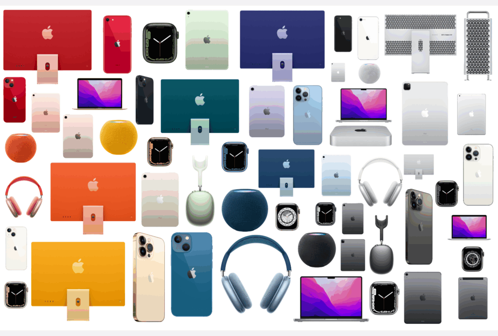
As 2026 approaches, this kind of adaptive minimalism is becoming the default, less noise, more clarity, and identities that stay consistent even as the formats keep changing.
2. Motion-first branding
Brands are designing for movement first because most interactions now happen on screens, not on printed surfaces.
That shift means a logo isn’t just judged by how it looks, but by how it behaves. A small animation, a transition, or even the way an element enters the frame can shape how modern audiences experience a brand.
This approach gives brands more room to express tone, pace, and personality. A slow, smooth motion feels calm. A sharp, quick animation feels bold. These moments become an integral part of the brand, just as much as its colors or typography.
Netflix is a good example of this shift. The static “N” mark is simple, but the animated ribbon that appears before every show has become a signature cue.
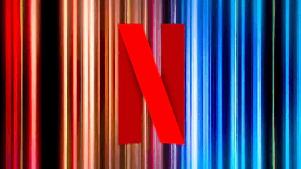
It signals the start of the Netflix experience and works consistently across mobile screens, TV interfaces, trailers, and marketing. The animation is now as recognizable as the logo itself.
As we move toward 2026, more brands will build their identities with this same mindset, starting with motion and letting everything else follow.
3. Audio and multisensory branding
Brand identity is widening beyond visuals as more interactions happen through devices where sound plays a natural role. A brief audio cue can signal a brand instantly, even when nothing is on screen.
It adds familiarity, sets the tone, and creates a small but memorable moment that stays with the user. These sensory touches, whether sound, texture, or the way a product feels in the hand, help build recognition in ways that visuals alone can’t.
The Windows login sound is a perfect illustration of this idea. For years, that short startup tone marked the beginning of the user’s experience. It wasn’t flashy, but it was distinct enough that people recognized it immediately, often without needing to see the logo or interface.

That simple audio cue became part of the brand’s identity and lived in users’ memories as a signature moment tied to Windows devices.
4. Inclusive and accessible identity design
Brands are putting more focus on identities that work for everyone. That means paying attention to color contrast, type clarity, motion sensitivity, and how designs translate across different cultures and languages. The goal is simple: an identity that stays consistent while remaining usable and readable for every audience.
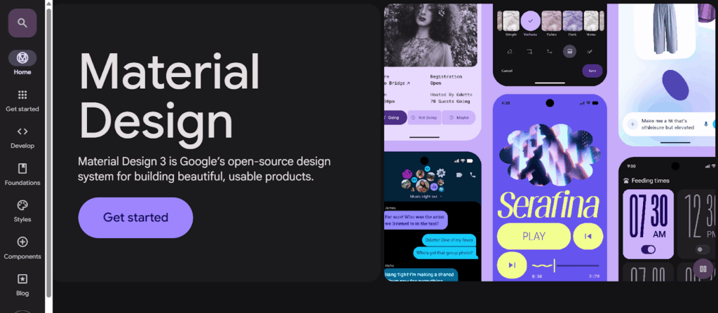
Google shows how this can be done well. Its Material Design system is built around accessibility from the start, clean typography, adaptable layouts, and color combinations that meet accessibility standards.
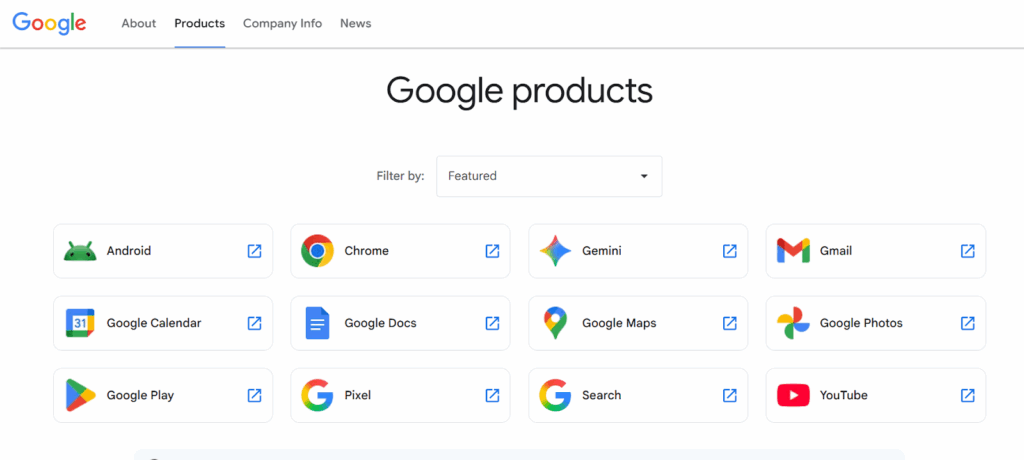
Whether someone is using a screen reader, viewing in low light, or switching languages, the experience still feels cohesive.
This push toward inclusive, accessible branding will only get stronger in 2026 as more companies design with the whole audience in mind, not just part of it.
5. AI-assisted brand asset creation
AI is becoming a practical part of everyday brand development, and by 2026 it won’t feel experimental. Instead of relying solely on long design cycles, teams can now generate early concepts, explore visual directions, and produce variations much more efficiently.
The value isn’t in replacing designers, it’s in giving them a faster starting point and more room to focus on refinement and strategy.
How brands are using it:
- Producing quick logo and icon concepts
- Generating campaign visuals in multiple styles
- Creating tailored assets for different audiences with minimal manual rework
Coca-Cola offers a strong example of this shift. Through initiatives like “Create Real Magic,” the brand uses AI to generate a wide range of visuals while maintaining its recognizable identity. The system allows the brand to produce fresh creative assets at scale, without losing the consistency that makes Coca-Cola familiar.
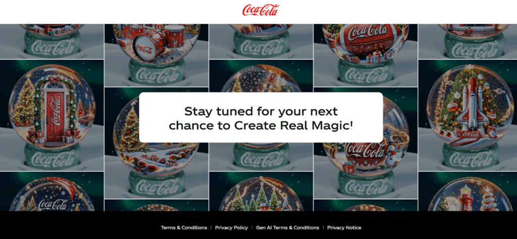
The core identity stays intact, but the creative possibilities multiply. They’re able to push out fresh visuals at a pace that fits today’s content demands.
This is where branding is heading: AI supporting the creative process, making it faster and more adaptable, while the brand’s core remains firmly in human hands.
6. Sustainable design choices
More brands are aligning their identity with the values they promote, and sustainability is leading that shift. This shows up in quieter color palettes, natural textures, and visual elements that reflect a more grounded, responsible approach.
It’s less about appearing “green” and more about creating an identity that feels honest and connected to the environment.
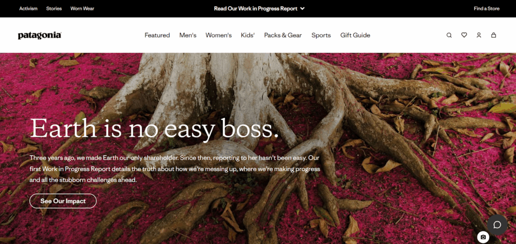
Patagonia has long taken this path. Its branding leans on earthy tones, simple layouts, and an overall aesthetic that mirrors the outdoors. Nothing feels excessive or ornamental, and that restraint reinforces the company’s commitment to environmental responsibility.
As 2026 approaches, expect more brands to make similar choices, using design to signal values rather than just style.
7. Personalized brand identity experiences
Brands are starting to shape their visuals around the individual, not the crowd. As digital platforms gather more context, like location, time of day, past behavior, or stated preferences, identity elements can shift in real time. Colors, backgrounds, or even small interface details adjust to match the user’s situation, making the experience feel more relevant without losing the brand’s core look.
Spotify has shown how effective this can be. Wrapped uses listener data to create personalized visual stories, color themes, and layouts tailored to each user’s habits.
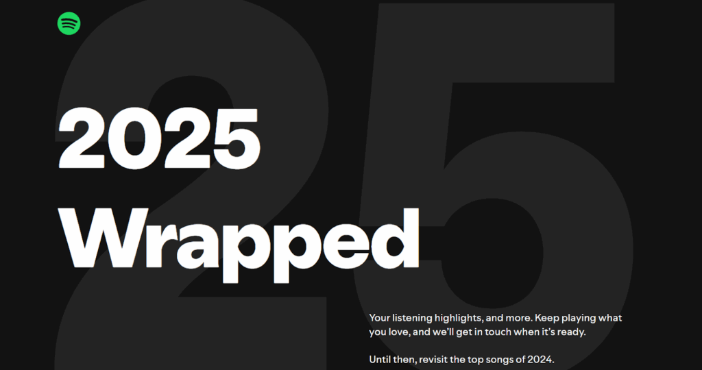
The brand keeps its overall style intact, but the experience still feels uniquely “yours,” powered by your own behavior. In 2026, this type of adaptive identity will become more common, with brands staying consistent at the foundation, while the surface-level visuals respond to each user in the moment.
8. Retro-Futurist and Nostalgic Palettes
Color trends are bending in two directions at once. On one hand, there’s a pull toward familiar shades, like tones that feel warm, worn-in, and a little vintage. On the other, brands are pairing those colors with sharp, tech-leaning visuals. The mix creates something that feels rooted in the past but pointed toward what’s ahead.
Expect to see more neon highlights, softened ’90s hues, metallic accents, and gentle grain layered over modern layouts. It’s a way to tap into emotion without slipping into a full throwback.
Nike has been using this balance across several campaigns. They’ll start with colors inspired by older product eras, think classic Air Max palettes, then drop them into scenes filled with futuristic lighting, holographic surfaces, or sleek digital textures. You get a subtle nod to the past, but the overall feel still leans fast, bold, and future-ready.
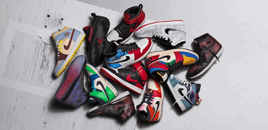
This tension is what makes the trend work: nostalgia draws people in, and the modern frame keeps the brand from ever feeling dated. That mix is becoming a go-to visual language as we move into 2026.
Conclusion
Branding in 2026 is all about clarity, flexibility, and choosing the trends that actually move your brand forward. The companies that stand out will be the ones that know how to evolve without losing who they are.
If you want help shaping that next version of your identity, Brand Strategy Lab has guided several brands through this same transition, and they can do the same for you.