For 60 years, one company has dominated color standards, without selling a drop of ink. You might know Pantone from its color of the year.
The Pantone Color of the Year Program engages the world in a conversation around a color each year, one that sets the tone for visual culture across industries. For brand strategists and designers, it’s more than a trend—it’s a signal. In 2025, that signal is warm, grounding, and quietly powerful.
Read on to learn more about using the Color of the Year 2025 in your next brand color palette.
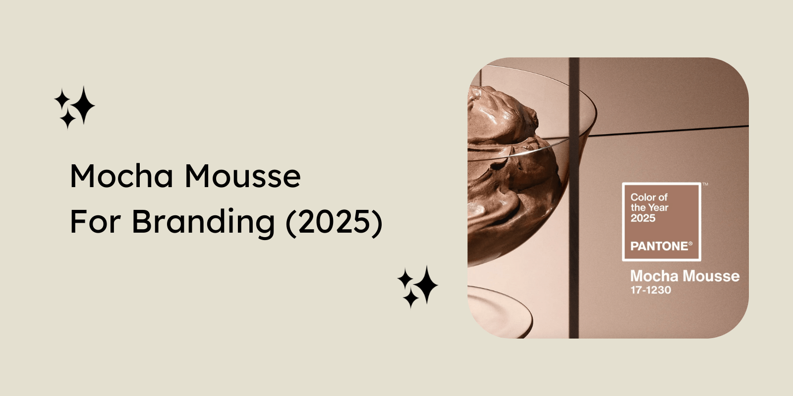
Meet Mocha Mousse (Pantone 17-1230)
Mocha Mousse, a warm brown hue with its earthy sophistication, is extending our perception of brown from humble and subtle to luxurious and aspirational. On the first glance, the soft, brown color seems comforting and inviting with a touch of refined elegance.

The neutral tone of Mocha Mousse, pairs effortlessly with not only the creams and beiges, but also the bolder hues. It stands out from the broader spectrum of browns due to its warm and soft undertones. Where taupe often feels washed out, cocoa seems too intense, the neutrality of Mocha Mousse keeps the palette effortlessly understated. This makes it ideal for brands that want to feel both comforting and contemporary.
The Psychology Behind Mocha Mousse
Color psychology tells us that neutral, earthy colors communicate trust, stability, and authenticity.
Think of how a cup of coffee brings you comfort. Similarly, Mocha Mousse evokes warmth, resilience, and familiarity. In a time of overstimulation, consumers perceive neutral tones as something real and trust-worthy.
Why Pantone Chose It for 2025
Every year, Pantone chooses a color. And every year, it reflects where the world stands. Right now, the world is leaning into warmth, calm, and comfort, and Pantone gets that. Mocha Mousse is a reflection of how we’re collectively moving toward this neutrality.
1. Slow Living and Intentionality
In a world that often feels too overwhelming and optimized, people are consciously taking a step back. Mocha Mousse aligns with this shift. While the bold colors demand attention and create a sense of urgency, this shade signals patience and meaningfulness.
2. Post-Digital Fatigue
After a decade of being chronically online, it’s no surprise that people are starting to pull away. They want something tactile, something that has texture. This is where Mocha Mousse steps in, with its grounded familiarity and warmth.
3. Shift Toward Comfort, Care, and Grounded Luxury
Today’s premium brands are leaning into quiet comfort. People are prioritizing experiences that feel authentic and meaningful. Mocha Mousse is ideal for addressing this shift. It suggests luxury that is rooted in emotional warmth and intention.
These cultural and emotional shifts made Mocha Mousse the natural choice for Pantone’s Color of the Year 2025.
Mocha Mousse and 2025 Branding Trends
Not long ago, pop colors were everywhere. Bright yellows, pinks, and blues dominated the branding space. They were bold, loud, and fun. And neutrals took a backseat. They lacked the personality that bright colors brought.
However, over time something shifted. People noticed that bright colors did more than just grab attention. They could energize, but also overwhelm. This led to a slow but definite return to neutrals.
Many industries are embracing this shift proactively, using these colors in their visual identities.
- Wellness, skincare, and mental health, where minimalism fosters trust.
- Sustainable fashion and eco-conscious brands, using earthy tones to reflect their mission.
- Artisanal food and beverage, to visually suggest warmth and texture.
- Hospitality, interior design, and lifestyle, that prioritize grounded and tactile spaces.
What Type of Brands Can Use Mocha Mousse Effectively
Like any color, its true power emerges when used in context. So, what kind of brands can make Mocha Mousse not just work, but work strategically?
1. Wellness & Self-care Brands
In an industry scattered with floral pinks and oranges, Mocha Mousse brings the necessary touch of something richer and more rooted. Whether it’s skincare, a yoga course or even a mindfulness app, Mocha Mousse stands out as grounded luxury. For packaging, this shade creates an experience that is humble yet premium.
For instance, Rhode, a beauty brand, has embraced this hue to create a comforting and approachable aesthetic.

2. Sustainable & Ethical Brands
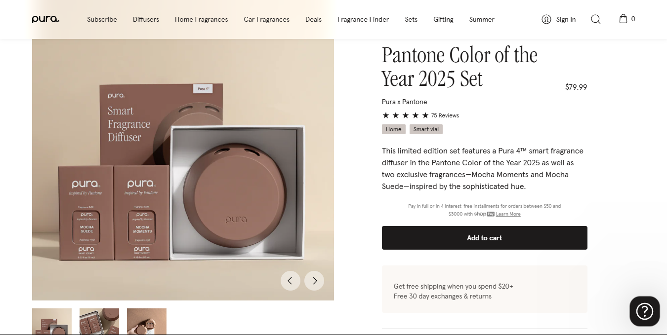
Seemingly tactile and tangible, Mocha Mousse invites customers to reach out and engage, making it a perfect shade for purpose driven startups, such as sustainable fashion or clean beauty brands. It reflects earth-conscious values and natural simplicity. Using this earthy tone in web-design or packaging seems less performative and more authentic, giving a quiet and clear signal – we care.
Pura, a clean, responsibly sourced fragrance brand, used Mocha Mousse in an exclusive launch, creating a complete sensory journey.
3. Artisan Food & Beverage
Coffee. Chocolate. Wine. Spices. Mocha Mousse belongs in this world. It evokes richness and heritage. More importantly, it suggests storytelling, bringing us back to the source, the soil, the wood. This shade can add a sensory feel to your visual identity. Brands can use Mocha Mousse as a base for everything, from their label design to their accents.
Brands like Tealeaves have introduced products inspired by this hue, such as their bespoke tea blend.

4. Luxury with a Soft Edge
Luxury is no longer gold and gaudy. More and more, high-end brands are moving from flashy to something softer, more personal, and intentional. This is where Mocha Mousse shines. For brands positioned at the intersection of premium and approachable, heritage and modern, this shade brings a tactile elegance to their visual identity.
5. Interiors & Homeware
The interior and home décor brands are already deep in the warm minimalistic space, and Mocha Mousse fits right in. It blends beautifully with natural materials like linen, wood and ceramics. For these brands, whether they are selling furniture, lighting, textiles, or curating content around these topics, this shade offers a middle ground. It is both timeless and trendy.
What makes it especially valuable in this category is its ability to last. While trends in this industry shift, foundational colors like this won’t feel dated even after months.
The exclusive Joybird x Pantone collaboration is an amazing example of bringing Mocha Mousse to life in this space.

6. Education or Personal Development Brands
Mocha Mousse gives the impression of depth and introspection, making it perfect for personal development brands. It feels wise and approachable which makes it ideal for coaching or learning platforms. The shade brings a stark contrast to the cold, corporate designs that litter this industry, with their intimidating blues and grays.
How to Use Mocha Mousse in Brand Strategy
Choosing Mocha Mousse is about making an intentional decision to align it with your brand, such that it supports your message and acts as an extension to your story.
But to make it work, you need to be thoughtful about where and how it shows up.
1. Brand Identity
Mocha Mousse, unlike most browns and beiges, has a presence. It works best when used intentionally. As a primary brand color, it communicates calm, warmth, and grounded luxury. Use it if your brand leans into authenticity and heritage. But more often, it thrives as a secondary or a grounding neutral, balancing bolder hues or a minimalistic palette.
Steal the following pairings to create a harmonious color palette for your next brand:
- Dusty Rose for a gentle, romantic feel.
- Forest Green to hint to a deep, natural connection.
- Warm Ivory for a calm, minimalistic palette.
2. Packaging Design
The shade is especially effective in packaging when paired with a rich, tactile finish. Think natural textures and matte materials.
Mocha Mousse isn’t meant to feel glossy and cold. Instead, it would work best with an artisanal touch – hand-drawn lettering, minimalistic illustrations and handcrafted quality. This would highlight its rich, natural appeal.
3. Digital Touchpoints
In the digital world, where most brands default to cool blues and grays, introducing a warm shade like Mocha Mousse not only creates a real differentiation, it softens the experience. It brings a human touch without losing the premium quality.
It makes your digital spaces feel welcoming and approachable, making them an extension of your brand. Integrating this color as a grounding neutral in your website, mobile app and email UI conveys a sense of calm, in a space that often feels overwhelming and over-stimulated.
4. Physical Branding
Mocha Mousse is also effective in physical spaces. In store design, signage, or print material, it creates a consistency that feels timeless. Whether it’s an accent wall or a printed brochure, this color grounds your brand in authenticity and tangibility. It’s especially meant for tactile environments, places where people experience your brand in person. Think cafes, studios, or salons.
Mocha Mousse is not flashy, but it doesn’t fade into the background either. When used strategically across your brand identity, it helps your product feel like an experience.
Where It Doesn’t Fit – Strategic Considerations
It wouldn’t be surprising that despite its warmth and sophistication, Mocha Mousse isn’t a universal fit. So before jumping on the bandwagon, consider the strategic reasons why it might not be the right choice.
Mocha Mousse feels slow, deliberate and calm. For brands that focus on speed and responsiveness, such as innovation-led tech brands, delivery brands or fintech apps, this color would send the wrong message. Using shades of blue, neon, and stark white would be more appropriate.
If your brand relies on visibility in a high-noise environment, such as supermarket aisles or digital feeds, Mocha Mousse might not be the color for you. The subtle neutrality means it would be easily overlooked in such an environment. The shade, therefore, is not suited for mass-market FMCG products.
Lifestyle categories have seen an incredible rise in the popularity of colors like taupe, cocoa, and mocha in their branding. However, this means Mocha Mousse risks seeming overused and generic in this context.
The key to using Mocha Mousse isn’t just knowing how to apply it, but also whether it should be applied.
Looking Ahead: The Future of Color in Branding
Color trends come and go. What feels fresh today can feel dated tomorrow. As we look towards the future, a crucial question arises – will neutral minimalism continue to dominate?
Over the past decade, neutral palettes have reigned across industries. It started as a reaction to the overstimulated digital space. But as the world evolves and attention spans shorten, brands are now experimenting pairing neutrals with bold, unexpected hues. The future may not abandon neutrals, but it will likely layer them.
With Gen Z’s growing love for maximalism, the pendulum swings between earthy and high-energy color trends.
So, what does this mean for brand strategists? It means color can’t just follow trends – it has to be intentional. The best strategies are the ones that evolve with trends but remain rooted in the brand messaging. The future might witness a tech brand pairing Mocha Mousse with silver to communicate warmth with innovation.
Final Thoughts
Mocha Mousse is more than a color—it’s a message of comfort, care, and quiet confidence. At its core, color in branding is about alignment. Strategic color use can emotionally align your brand with your audience.
Ready to refresh your brand’s palette? Connect with The Brand Strategy Lab to craft a visual identity rooted in meaning.