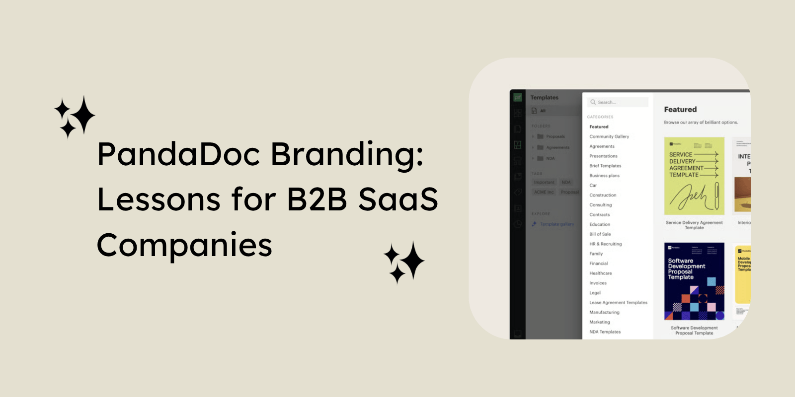
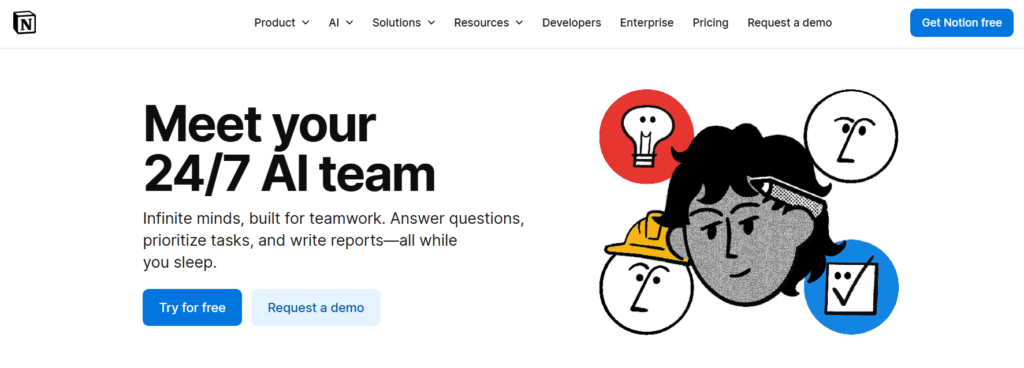
Notion is an all-in-one productivity and workspace platform used for note-taking, project management, collaboration, and internal documentation.
Founded in 2013 by Ivan Zhao and Simon Last, it has grown into one of the most recognized names in the B2B SaaS space, with over 100 million users and an estimated valuation of $11 billion.
Its success comes from multiple factors, but one area that particularly stands out is branding. While we have never worked on Notion’s branding ourselves, it is genuinely one of the strongest examples of modern B2B SaaS branding.
In this blog, we will break down 10 branding lessons B2B SaaS companies can learn from Notion’s growth and market positioning.
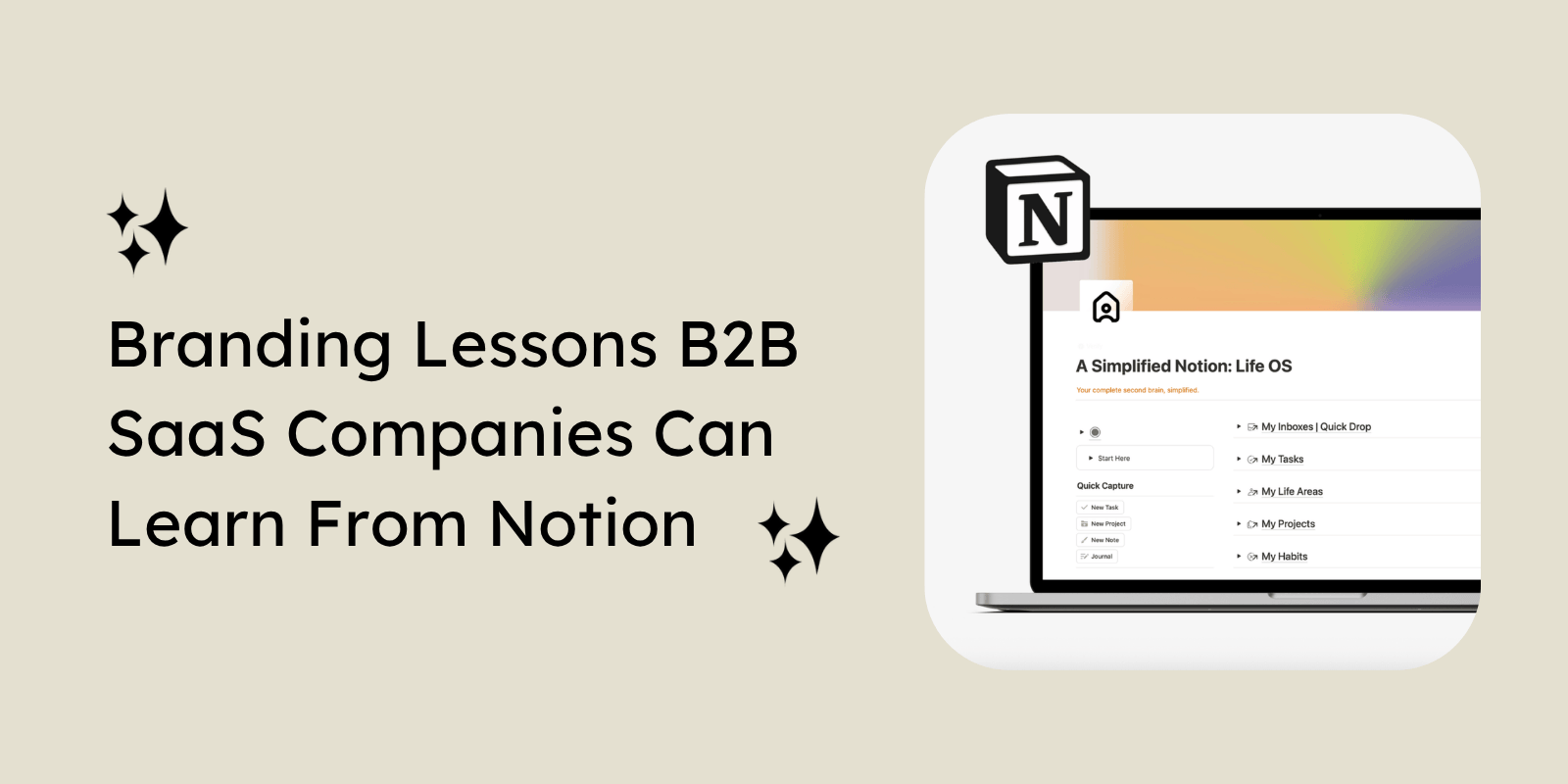
10 Branding Lessons for B2B SaaS Companies From Notion
Here are 10 branding lessons B2B SaaS companies can learn from Notion’s positioning, messaging, design consistency, and overall brand perception:
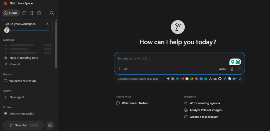
1. Turn Simplicity Into a Brand Philosophy, Not Just an Aesthetic
Notion doesn’t treat simplicity as a design choice; it treats it as a belief system. The entire experience, from its black-and-white palette to its generous whitespace and restrained interface, is built around one idea: clarity over clutter.
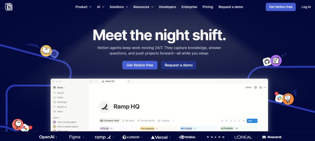
What makes this different is intent. The minimalism doesn’t feel like a visual trend or a stripped-down UI. Instead, it feels deliberate, almost philosophical. Every element that’s removed feels as important as what remains.
That’s where the lesson lies for B2B SaaS brands. Simplicity only becomes powerful when it signals a point of view. When it communicates how a company thinks, not just how it designs. Otherwise, it risks feeling empty or generic.
2. Use Typography to Create Intellectual Character
Notion’s typography goes beyond function and becomes part of its personality. It feels editorial, structured and almost publishing-like, which gives the product a sense of craft and intellectual weight.
Rather than relying on heavy styling or visual noise, the type system works quietly in the background. It creates hierarchy, guides attention and adds rhythm to the reading experience while maintaining a calm and focused feel.
For B2B SaaS brands, the key lesson is that typography is not only about readability. It is a brand signal that shapes perception. It influences how intelligent, credible, and thoughtful a product feels even before the user interacts with it.
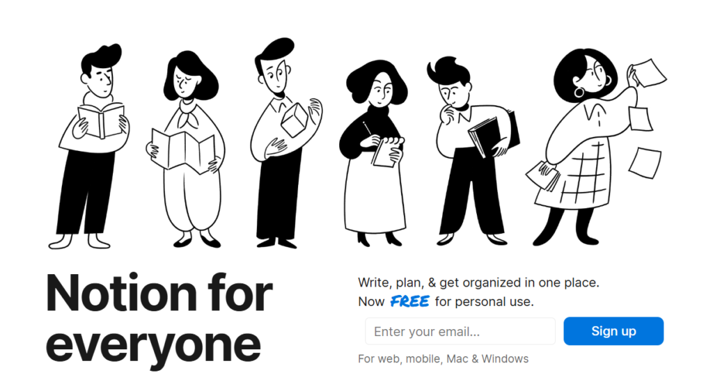
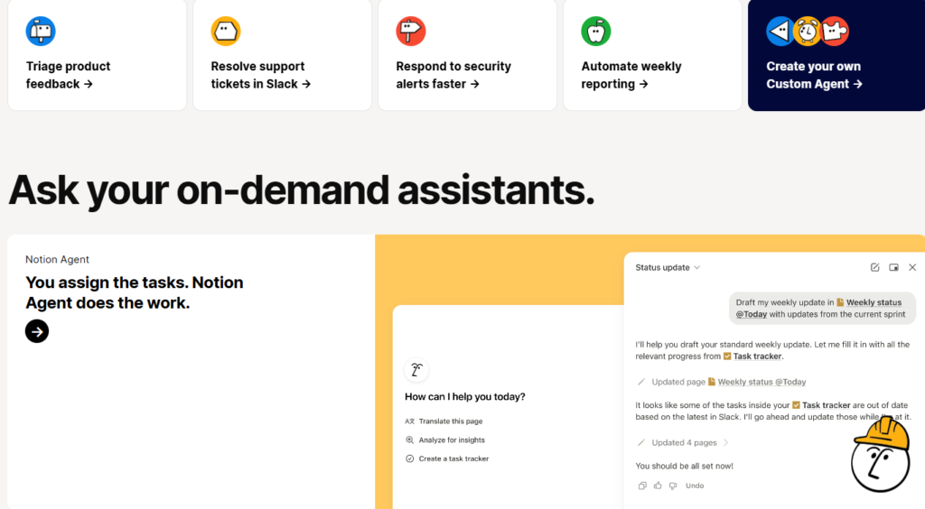
3. Make Illustrations Part of the Brand’s Emotional Architecture
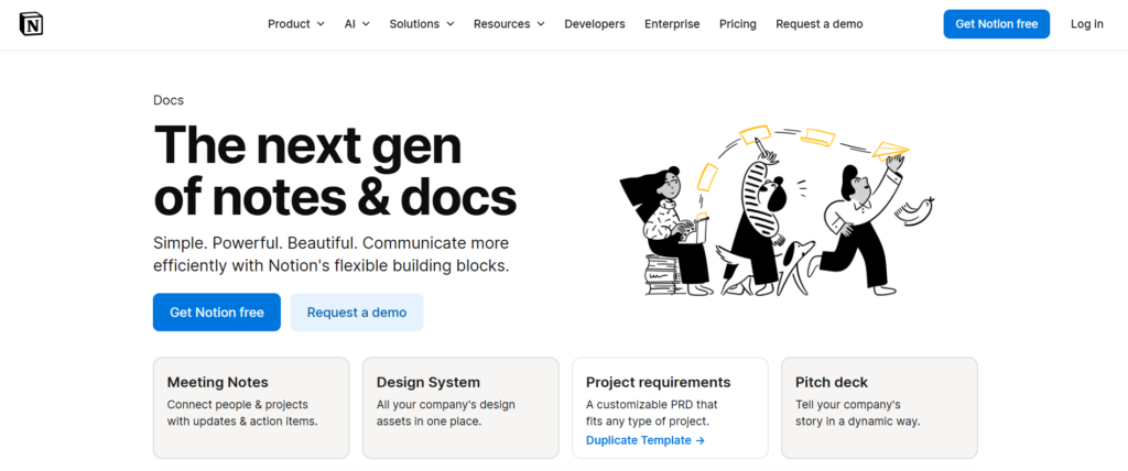
Notion uses hand-drawn illustrations to bring warmth into an otherwise highly structured product. They soften the experience and make abstract ideas feel more human, approachable, and less mechanical.
These visuals are not just decorative elements. They help interpret the product experience, turning workflows, concepts, and empty states into something more relatable and expressive. This adds an emotional layer to a system that is fundamentally about structure and organization.
For B2B SaaS brands, the lesson is that illustration should not be treated as an afterthought. When used intentionally, it becomes part of the brand system itself, shaping how users feel about the product rather than just how it looks.
4. Build a Brand That Feels Like a Tool for Thinkers
Notion feels intentionally designed for people who think in systems, ideas, and structures. From its visual restraint to its calm tone, everything signals that this is a tool built for clarity, creativity, and deep work.
It never explicitly defines its audience in loud or restrictive terms. Instead, it attracts them through cues. The experience quietly conveys that this is a space for writers, builders, planners, and problem-solvers who value both order and flexibility.
For B2B SaaS brands, the takeaway is that strong positioning is often implicit. A brand does not need to say who it is for directly if the design, tone, and product experience consistently reflect the mindset of its ideal user.
5. Let Tone of Voice Feel Intelligent but Uncomplicated
Notion’s tone of voice is calm, clear, and quietly confident. It avoids unnecessary complexity, doesn’t over-explain, and never feels overly promotional or forced. The messaging stays precise and intentional, which builds trust without relying on heavy persuasion.
For B2B SaaS brands, the lesson is that authority doesn’t need to be loud. It comes from clarity and restraint. When language is simple, well-structured, and deliberate, it often feels more intelligent and credible than anything overly expressive.
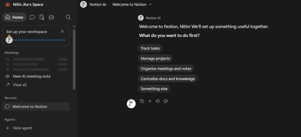
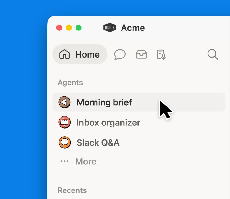
6. Use Brand Assets as a System, Not Isolated Elements
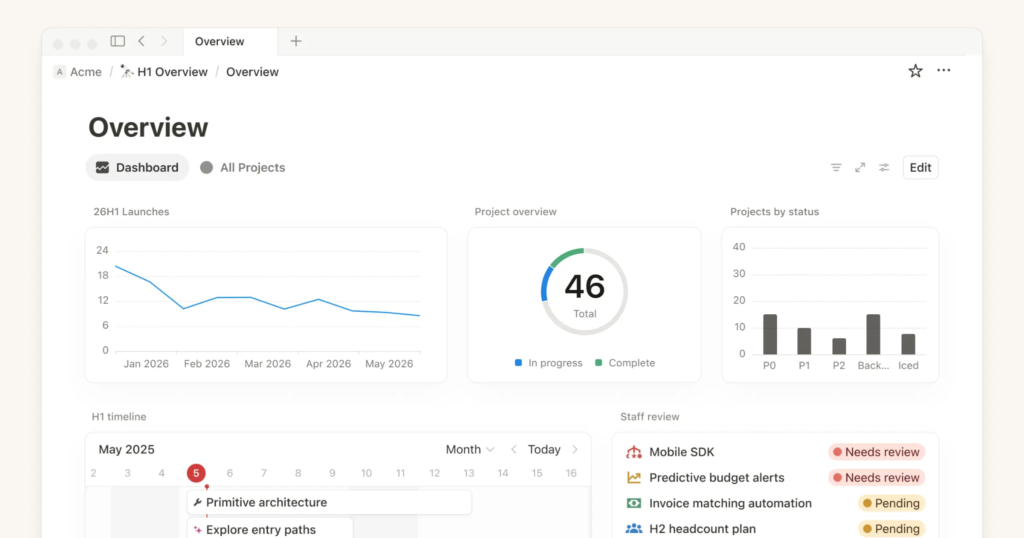
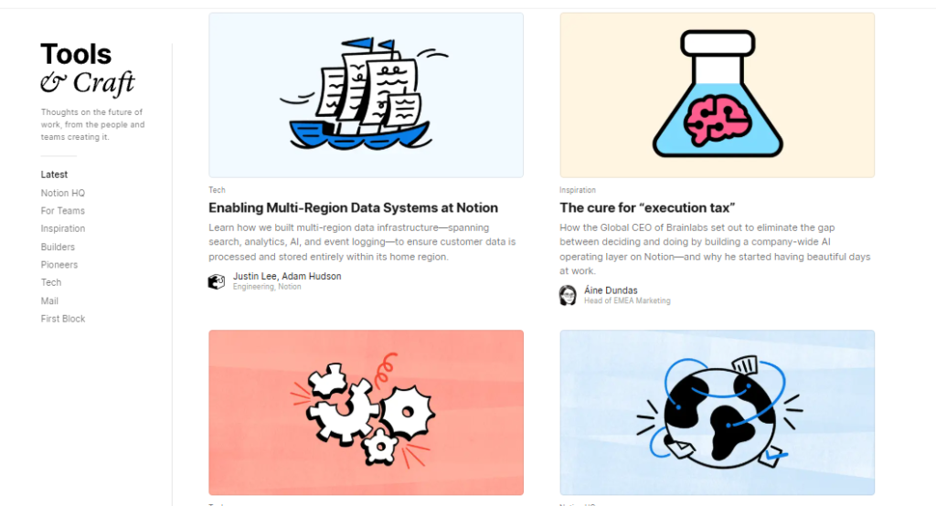
Notion keeps its brand consistent by making every element part of a single design system. The typography, icons, spacing, and UI components all follow the same rules, so whether you are on the homepage, inside the product, or reading a help page, everything feels connected.
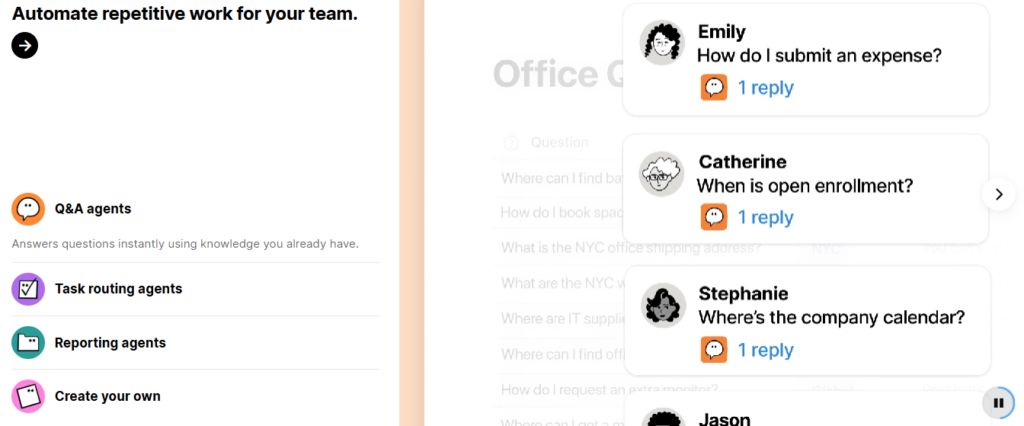
Even across different surfaces like marketing pages, product screens, and documentation, the same visual logic repeats. You see the same icon style, the same calm spacing, and the same structured layout rhythm, which makes the experience feel unified instead of fragmented.
For B2B SaaS brands, the lesson is that consistency is not about matching colors or fonts alone. It is about designing a shared system in which every asset follows the same underlying logic at every touchpoint.
7. Balance Structure With Warmth
Notion strikes a careful balance between structured productivity and emotional softness. The product is built on logic, organization, and systems thinking, but it never feels cold or mechanical. The clean layouts and rigid structure are softened by subtle design touches that make the experience feel approachable.
This combination is what sets it apart. It gives users the confidence of a powerful system while still feeling inviting enough to actually enjoy using it. Many SaaS brands fail here by leaning too far into either sterile efficiency or overly playful design, but Notion sits comfortably in the middle.
For B2B SaaS brands, the lesson is that structure and warmth are not opposites. When balanced correctly, they create products that feel both reliable and human.
8. Make Your Visual Language Feel Ownable
Notion does this through its signature hand-drawn illustration style. For example, even simple elements like the FAQ section illustration of a character leaning in and cupping their ear to “listen” turn functional parts of the product into memorable brand moments. These sketches are playful but intentional, and they show up consistently across different states of the product experience.
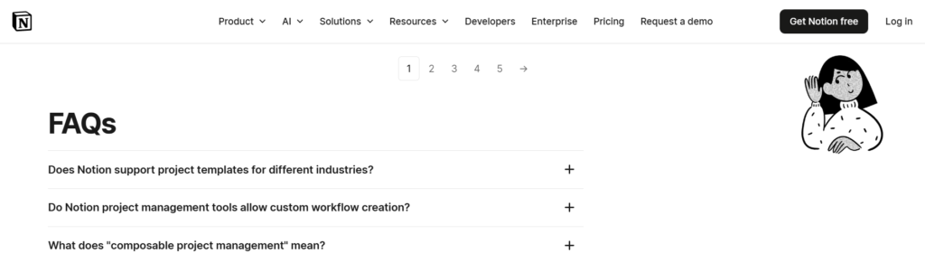
Along with its monochrome palette and editorial layouts, this illustration style creates a visual identity that feels unmistakably Notion. It proves that when brand visuals are coherent and distinctive, they stop being decoration and start becoming recognition signals.
9. Treat Brand as World-Building
The key lesson is that strong branding goes beyond design and messaging to create a world people want to be part of. When a brand feels like a universe rather than just a product, it builds a stronger emotional connection and recall.
Notion achieves this through consistent imagery, metaphors, and design cues that extend beyond the interface. It does not just position itself as a productivity tool, but as a creative space where ideas, systems, and thinking come together.
Over time, this creates a distinct brand world. Users are not just using Notion; they feel they are operating within its ecosystem of creation and structure, making the brand far more memorable and immersive.
10. Let the Brand Reflect a Point of View About Work and Creativity
The strongest brands communicate a philosophy, not just an identity. Beneath Notion’s visuals and interface is a clear point of view about work, creativity, and how people organize ideas.
Everything from the product structure to the messaging reinforces flexibility, intentional thinking, and creative control. It positions productivity not as rigid task management, but as a more thoughtful and customizable way of working.
That is what makes the brand feel more than just aesthetics. Notion is not just selling software; it is promoting a particular way of thinking and creating, which gives the brand stronger meaning and long-term resonance.
Conclusion
Notion branding stands out because it goes beyond aesthetics and creates a clear, memorable identity around work, creativity, and organization. Its minimalist design, calm messaging, and consistent visual language make the brand instantly recognizable.
That is the bigger lesson for B2B SaaS companies. Strong branding is not just about visuals. It is about building a brand people remember, trust, and return to. If you are looking to create the same level of clarity and recall for your SaaS business, The Brand Strategy Labs can help.
With over a decade of experience helping SaaS brands grow through strategic branding, the team focuses on creating identities that not only attract attention but also build long-term brand recall.