PandaDoc started as a proposal and e-signature tool.
Today, it has evolved into a complete document workflow platform that helps businesses create, collaborate, automate, sign, analyze, and get paid.
That expansion is impressive.
But what makes PandaDoc worth studying is how it scaled its product offering without losing brand clarity. While many SaaS companies become harder to understand as they add features, PandaDoc has maintained a focused and consistent market position.
In this blog, we’ll break down PandaDoc’s brand strategy and uncover the lessons B2B SaaS companies can apply to build stronger, more scalable brands.
Breaking Down the Brand Strategy of PandaDoc
Here’s a breakdown of the brand strategies that helped PandaDoc scale:
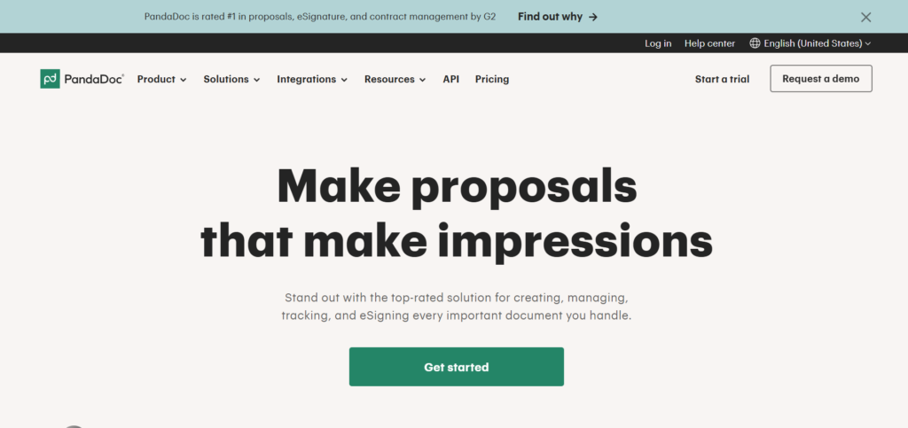
1. PandaDoc Sells Outcomes, Not Documents
One of PandaDoc’s strongest branding decisions is its focus on outcomes over features. Across its website, the company rarely describes itself as document software. Instead, it emphasizes results such as creating, approving, tracking, and eSigning documents 40% faster, accelerating deal cycles, and improving team productivity.
This works because buyers don’t actually want document management tools. They want fewer delays, faster approvals, and smoother workflows that help them close deals and generate revenue. For B2B SaaS brands, the lesson is simple: stop leading with what your product does and start leading with what customers achieve after using it.
2. Their Brand Positioning Is Remarkably Clear
Many SaaS companies become trapped by the category that made them successful. PandaDoc has avoided that fate. Rather than positioning itself as an e-signature tool, it consistently presents itself as a document workflow automation platform.
That distinction matters. It gives the brand ownership of a broader problem space while remaining clear and understandable to buyers. As a result, PandaDoc can expand into CPQ, payments, approvals, and deal rooms without the brand feeling scattered or disconnected.
The broader takeaway is that category choice shapes growth. Positioning around a feature may create short-term clarity, but positioning around a problem creates room to evolve. PandaDoc’s brand shows how a well-defined category can support expansion without sacrificing focus.
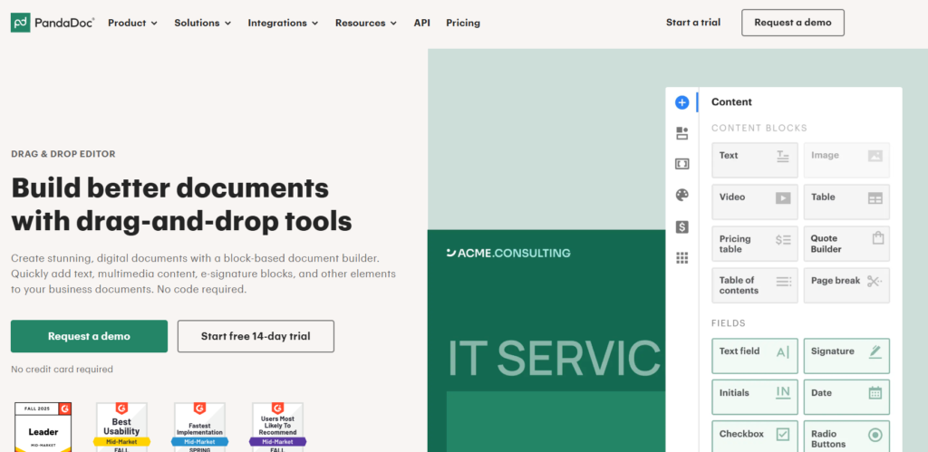
3. PandaDoc Uses Simplicity as a Brand Asset
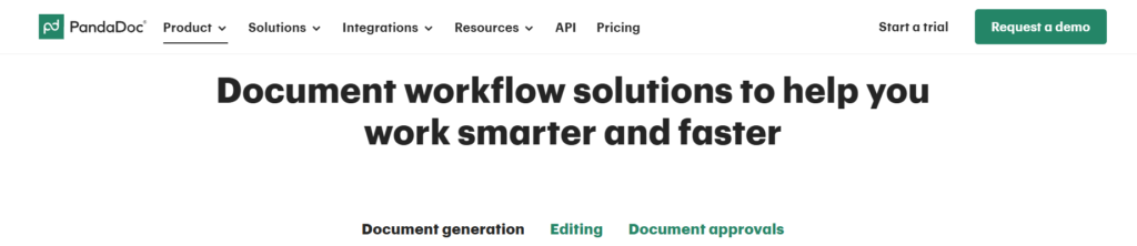
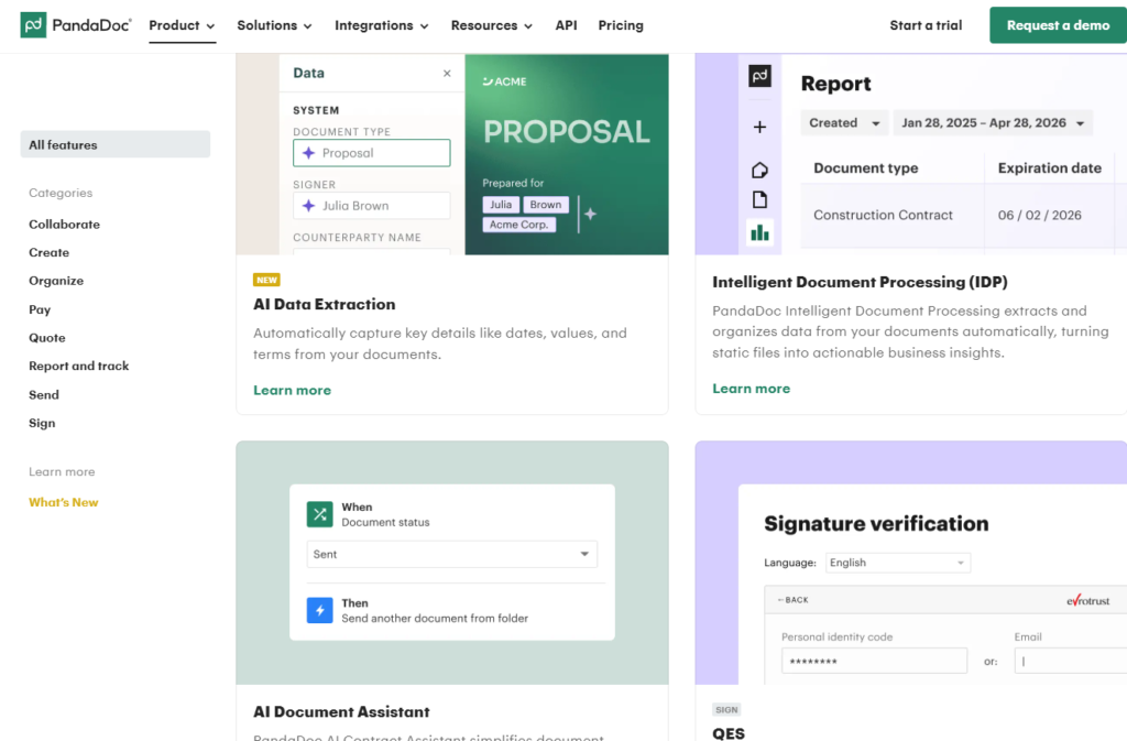
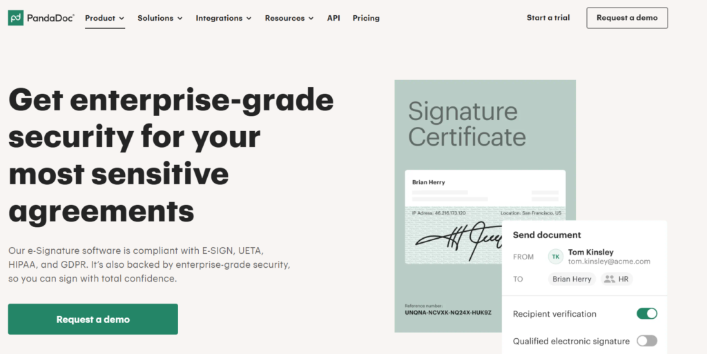
The PandaDoc website feels simple before it feels powerful. Clean layouts, generous white space, clear messaging, and intuitive product screenshots make the platform look approachable from the first interaction.
This isn’t just a design preference. It’s a branding decision. The visual experience reinforces the promise of a streamlined workflow long before visitors explore features or request a demo. By making the product appear easy to understand and use, PandaDoc reduces perceived complexity and builds confidence early in the buying journey.
It’s a reminder that visual identity should reflect product experience. Brands that promise simplicity but communicate through cluttered pages, dense copy, and overwhelming interfaces create an immediate disconnect.
4. Their Visual Identity Feels Modern Without Chasing Trends
PandaDoc’s visual identity is modern, but not trendy. Structured layouts, clean sans-serif typography, and a restrained colour palette create a professional look that feels current without relying on the latest design fads.
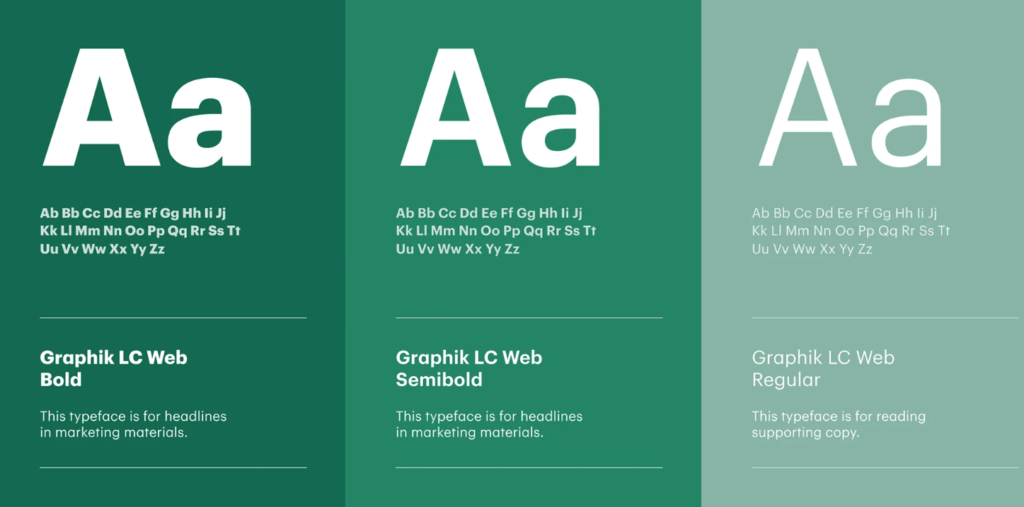
Unlike many SaaS brands that lean heavily on flashy gradients, oversized illustrations, or short-lived visual trends, PandaDoc prioritizes clarity and consistency. The design supports the message rather than competing with it.

That restraint creates durability. The brand feels trustworthy, polished, and built to last. It’s a reminder that strong visual identities are designed for years, not design cycles, and that long-term brand equity often comes from consistency rather than constant reinvention.
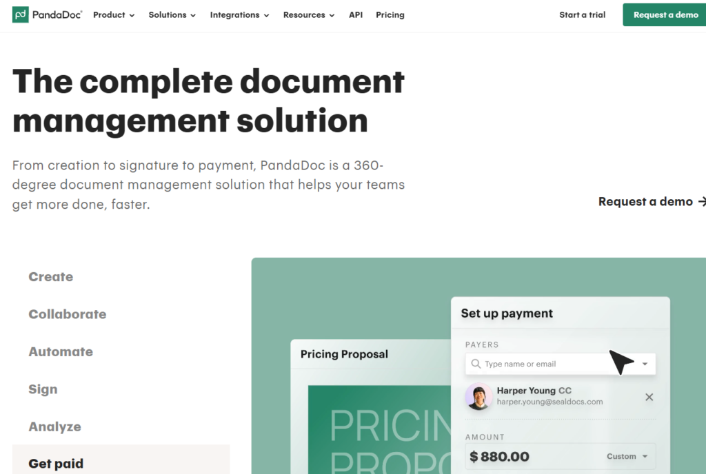
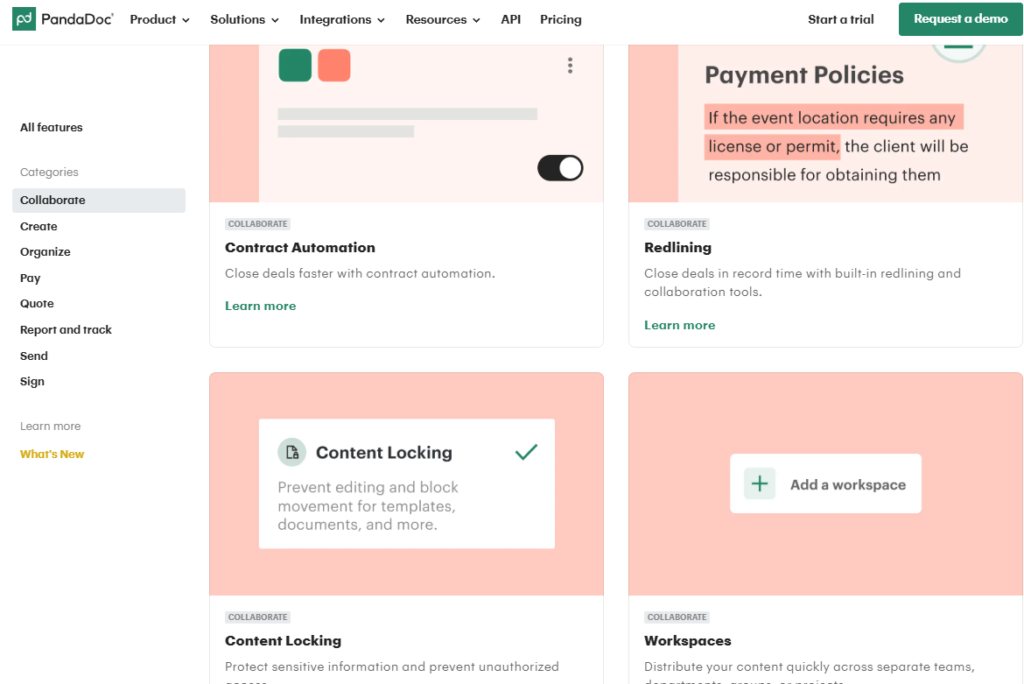
5. The Brand Architecture Supports Platform Expansion
PandaDoc started with proposals and e-signatures, but its growth into CPQ, payments, deal rooms, approvals, and workflow automation feels surprisingly natural. That’s because every new capability connects back to the same core narrative of reducing friction throughout the document and deal lifecycle.
Rather than appearing as separate products, each addition extends the platform’s ability to help teams move deals forward faster. The result is a product ecosystem that feels cohesive rather than fragmented. It also highlights the importance of scalable brand architecture.
Brands built around a clear narrative can expand into adjacent categories more easily because customers already understand how new offerings fit into the bigger story.
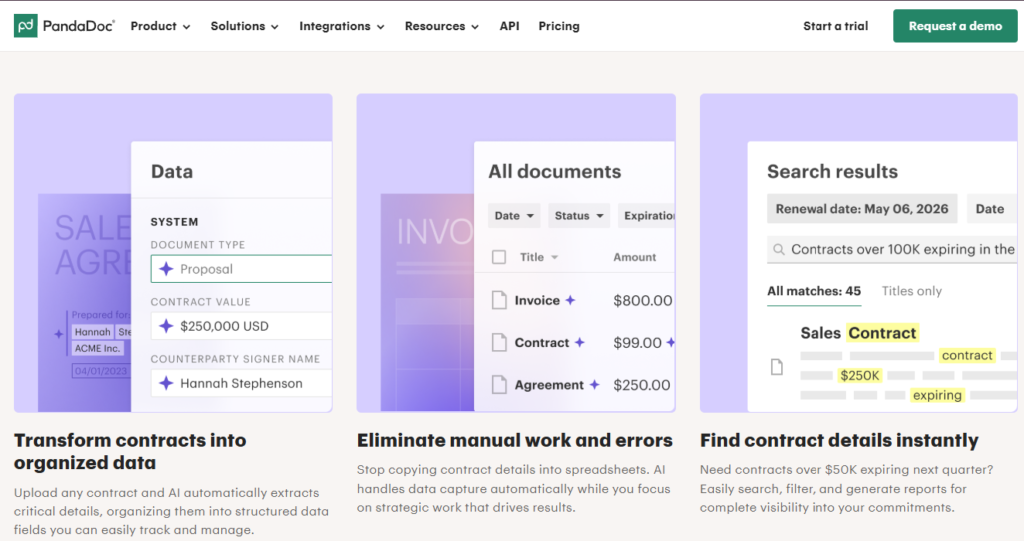
6. PandaDoc Makes Complex Workflows Feel Accessible
PandaDoc handles complex processes, but its messaging rarely feels complicated. Instead of relying on enterprise jargon, it uses simple language such as “create, approve, track, and eSign” to explain functionality like workflows, order signing, audit trails, integrations, and automated document generation.
This makes the platform feel approachable from the start. Buyers don’t need to understand the underlying complexity to understand the value.
That matters because business leaders approve many B2B software purchases, not technical teams. PandaDoc focuses on clarity over complexity, making adoption feel achievable. It’s a useful reminder that complexity can live inside the product, but it shouldn’t live inside the messaging.
7. Their Branding Reinforces Professionalism and Trust
Trust is a consistent theme throughout PandaDoc’s brand, but it’s rarely the main story. Security, compliance, and enterprise readiness are clearly visible through signals such as SOC 2, HIPAA, GDPR, ESIGN, and UETA compliance, yet they are presented as supporting evidence rather than headline claims.
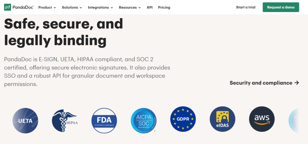
This approach works because trust is built alongside value. Buyers first understand what PandaDoc helps them achieve, then find the reassurance that it is secure, reliable, and enterprise-ready.
The result is a brand that feels confident rather than defensive. PandaDoc shows that trust signals are most effective when they strengthen the story you’re telling, not when they become the story itself.
8. PandaDoc Understands That Brand Experience Extends Beyond Marketing
PandaDoc’s brand doesn’t end at the website. Customers use the platform to create and send proposals, contracts, and other client-facing documents, turning everyday workflows into branded experiences.
As a result, the company’s emphasis on professionalism, clarity, and efficiency is reinforced every time someone interacts with the product. The brand is experienced through usage, not just messaging.
This highlights an often-overlooked aspect of branding. Every customer touchpoint, from templates and workflows to onboarding emails and notifications, should reinforce the same positioning and brand promise.
9. Their Tone of Voice Balances Authority and Accessibility
PandaDoc strikes a balance that many B2B brands struggle to achieve. Its messaging feels knowledgeable and professional without sounding overly corporate or formal.
Lines such as “Make proposals that make impressions” add personality while staying focused on business value. Across the website, the tone remains approachable, confident, and customer-focused rather than relying on buzzwords or exaggerated claims.
This balance broadens the brand’s appeal. Decision-makers see a credible platform, while end users see a product that feels approachable and easy to adopt. The result is a brand voice that feels expert without feeling distant.
10. PandaDoc Built a Brand Around a Single Strategic Idea
Many SaaS brands accumulate products faster than they accumulate meaning. Over time, the company becomes harder to describe because every new feature adds another story to tell. PandaDoc avoids that problem by anchoring its brand to a single idea, helping businesses move work forward.
The result is a brand that remains easy to understand despite an expanding product portfolio. Customers don’t need to memorize every feature; they only need to understand the role PandaDoc plays in helping their business operate more efficiently.
Branding Elements Worth Studying
Beyond its positioning and messaging, PandaDoc demonstrates strong execution across the core elements of brand building.
Visual Identity
PandaDoc relies on clean layouts, generous whitespace, modern typography, and a consistent
interface-driven design language. The result is a brand that feels professional, approachable, and built for longevity.
Messaging
Its messaging stays focused on outcomes rather than features. Clear value propositions, customer-centric language, and minimal jargon make the platform easy to understand regardless of technical expertise.
Brand Architecture
Every product fits within a unified platform narrative. New capabilities feel like logical extensions of the brand, creating consistency as the product portfolio grows.
Customer Experience
The brand extends beyond marketing into the product itself. From templates and documents to workflows and customer interactions, PandaDoc reinforces the same themes of simplicity, professionalism, and efficiency at every touchpoint.
Key Branding Lessons from PandaDoc
Here are the key branding lessons B2B SaaS companies can take away from PandaDoc’s approach:
- Sell the outcome customers want to achieve, not the features that deliver it.
- Position your brand around a broader problem category that leaves room for future growth.
- Use simplicity as a strategic differentiator, especially in complex software categories.
- Build a visual identity that reinforces the experience your product promises to deliver.
- Create a scalable brand architecture so new products fit naturally into the existing story.
- Make complex solutions feel approachable through clear messaging and intuitive communication.
- Use trust signals to support your value proposition rather than making them the entire message.
- Extend your brand beyond marketing and into every customer-facing experience.
- Write in a way that feels human, confident, and easy to understand.
- Build your brand around a single strategic idea that customers can quickly remember and associate with your company.
Final Thoughts
PandaDoc shows that great B2B SaaS branding isn’t about adding more features or louder marketing. It’s about creating clarity, consistency, and a brand that can scale as the business grows.
The goal isn’t to copy PandaDoc’s branding, but to apply the strategic thinking behind it.
At The Brand Strategy Labs, we’ve spent over a decade helping B2B SaaS companies strengthen their positioning, messaging, and brand strategy. If you’re looking to build a brand that stands out and supports long-term growth, talk to our experts today.