
Great coffee isn’t enough. A great brand makes it unforgettable.
Even with a solid product, branding is what makes people care, remember, and come back. When every element, from the name to the tone of voice aligns with what your customer wants to feel, you’re not just selling coffee. You’re building a brand people wake up to.
Sleepy Owl proves this. In just a few years, they’ve brewed their way into urban India’s caffeine habits, not through loud ads, but through consistent, smart, and strategic branding.
In this breakdown, we look at how Sleepy Owl layered smart branding into every move, and what coffee brands can learn from it.
Deep dive into Sleepy Owl Branding Strategy
We have tried to cover every little aspect of what the coffee brand is doing right:
1. Branding Starts With the Name
Sleepy Owl is a name that does a lot with very little. It hints at late nights, early mornings, caffeine, and comfort, all in two simple words. It’s memorable, approachable, and immediately connects with the reason people drink coffee in the first place.
Great naming is a branding shortcut. “Sleepy Owl” isn’t just cute. It’s sticky, functional, and emotional. It evokes both the problem (sleepiness) and the solution (coffee) without spelling anything out. That’s strategy.
It’s also easy to recall, easy to say, and easy to search. In a D2C space where discoverability matters, those three things are non-negotiable.
2. Logo and Visual Identity
If you’ve seen the Sleepy Owl packaging once, you’ll recognize it again. Recognition starts visually.
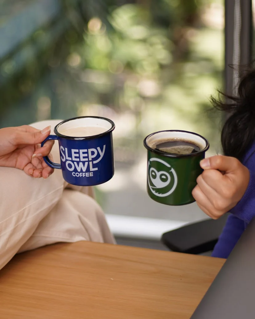
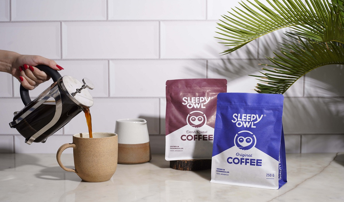
Sleepy Owl’s logo, a stylized owl that doubles as a coffee cup, is both clever and clean. The owl (late nights, alertness) + the coffee cup (the product) merge into one image. That’s not just design, it’s concept-driven branding.
Their fonts are rounded and friendly, creating a soft, accessible vibe. The color palette sticks to the roots: deep browns (coffee), cool blues (calm), and neutral beiges (balance).
Every touchpoint – packaging, website, Instagram, carries this visual identity forward. It’s not just consistent, it’s cohesive. You don’t need to read the name to know it’s Sleepy Owl. And that’s the hallmark of strong brand recognition.
3. Tone of Voice and Messaging
If the visuals hook you, the voice keeps you. Sleepy Owl’s tone is light, clear, and caffeine-smart. They don’t overexplain or oversell, they get to the point with warmth.
The website copy is clean and conversational. Social media captions balance fun with function. Even their product pages have easy CTAs and friendly FAQs that sound like a friend, not a pushy seller.
Their tagline “Coffee that works for you” ties it all together. It promises both quality and ease. The tone stays consistent across emails, blogs, packaging, and ads. It’s not just what they say, it’s how reliably they say it.
4. Market Positioning and Competitor Edge
Sleepy Owl found its edge by understanding that most people love café coffee, but not café logistics.
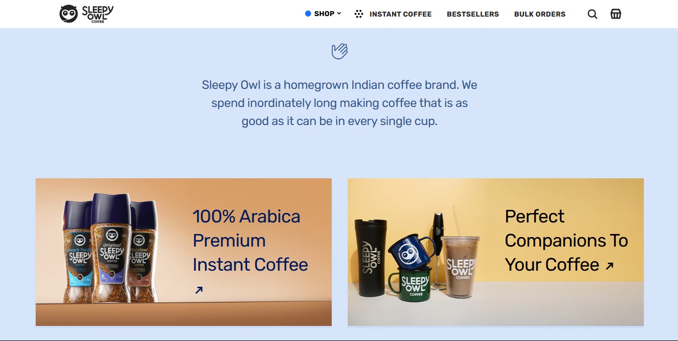
While competitors like Blue Tokai and Third Wave leaned toward the artisanal, Sleepy Owl stayed grounded. Their ready-to-drink (RTD) formats, hot brew bags, and cold brews brought café-quality to kitchens and backpacks.
They didn’t market themselves as luxury or niche. They marketed as accessible and clever. It positioned them perfectly for working professionals, students, and casual drinkers who wanted good coffee without the intimidation or prep.
In a saturated market, Sleepy Owl didn’t try to be the “best coffee.” They aimed to be the most convenient great coffee. That’s a different play.
5. Understanding the Audience
Sleepy Owl knows exactly who it’s talking to: urban millennials, young professionals, and caffeine lovers in Tier 1 and 2 cities.
This group values convenience, design, and direct-to-door delivery. The brand’s every choice, from resealable packaging to Instagram explainers, is built for their lifestyle.
Product formats work for both bulk buyers and impulse shoppers. Subscription options make repeat buying easy. Even the pricing is just right, not premium, but not cheap.
They’re not trying to please everyone. They’re just doing a good job speaking to the people who already want them.
6. Product Strategy
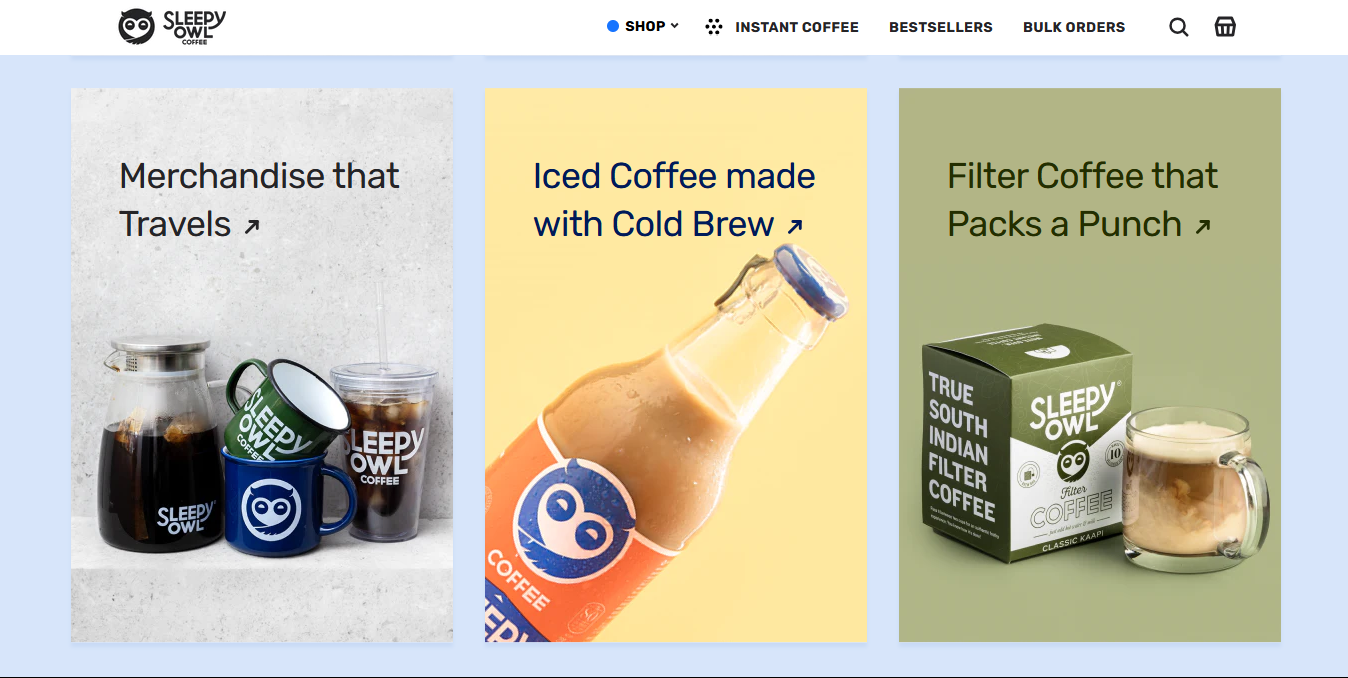
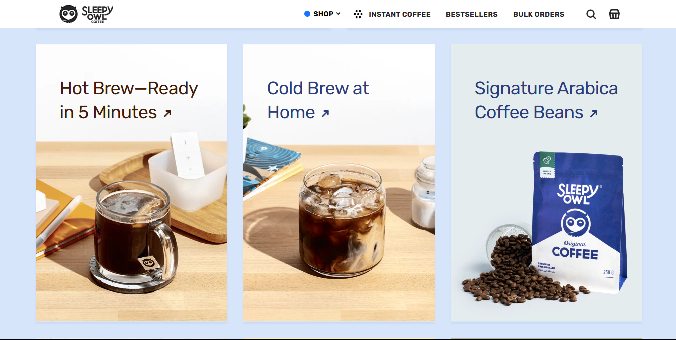
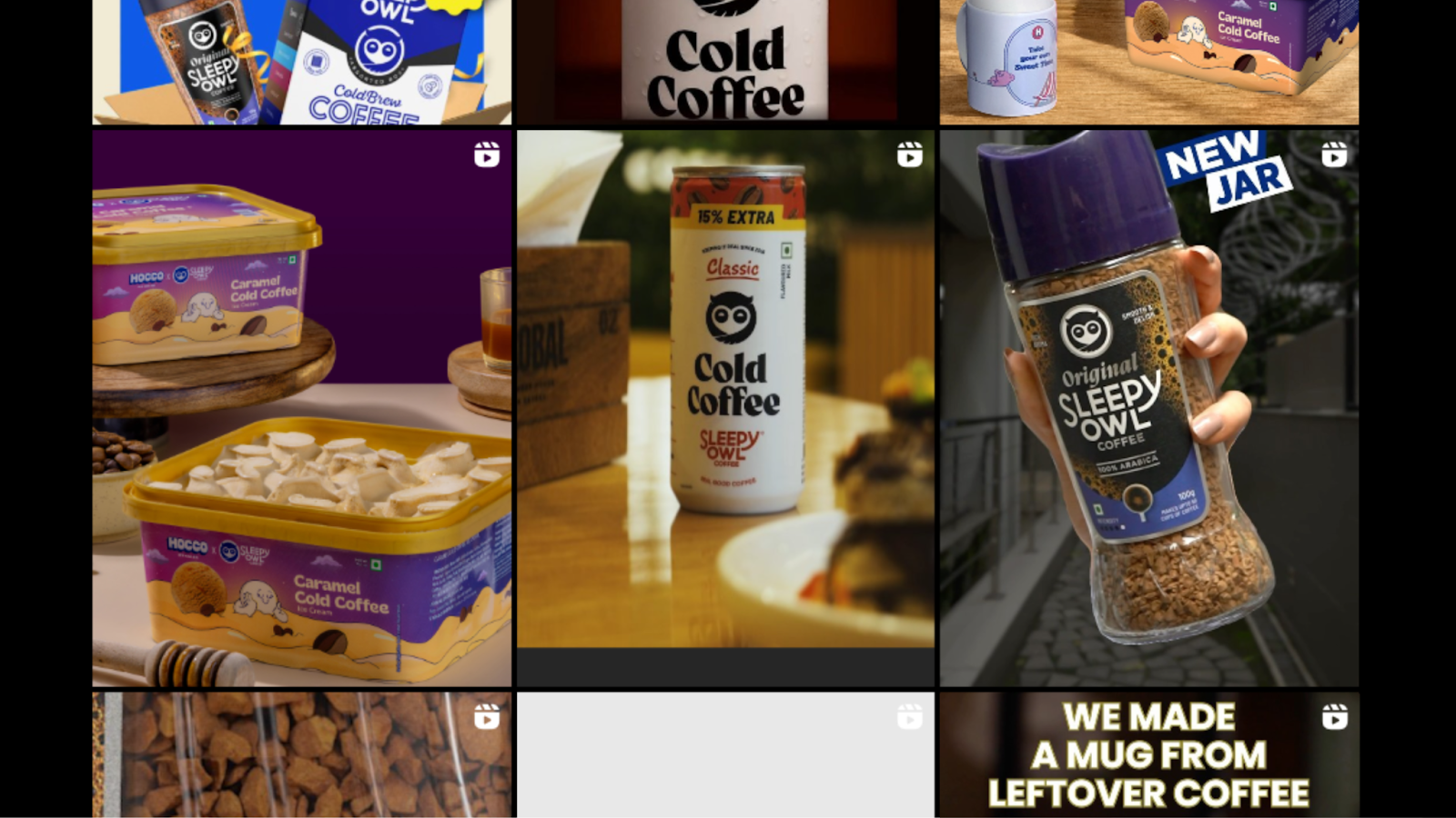
Sleepy Owl isn’t just in the business of selling coffee, they’re redefining how India drinks it. From hot brew bags to cold brews and instant mixes, the variety caters to different drinking habits and preferences.
Format First, Always
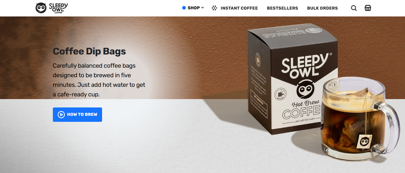
What sets Sleepy Owl apart is their format-first innovation. They didn’t just launch another coffee powder or café, they focused on making great coffee accessible without machines or barista skills. Cold brew bottles for grab-and-go, hot brew bags for a clean desk setup, and instant mixes for late-night sips.
Thoughtful SKU Expansion
Despite having multiple SKUs, Sleepy Owl doesn’t overwhelm. Every new product, be it a limited-edition flavor, a sampler pack, or a branded accessory, feels like a natural progression rather than a desperate experiment. Their launches build curiosity but stay true to the brand promise: great-tasting coffee made simple.
Packaging That Explains Itself
Perhaps their smartest move? Treating packaging as part of the product experience. Each box or bottle not only looks great but comes with clear brewing instructions, premium finishes, and portability in mind. From resealable pouches to sturdy bottles, the packaging reinforces quality and ease, making Sleepy Owl a daily companion for caffeine lovers.
7. Marketing Channels
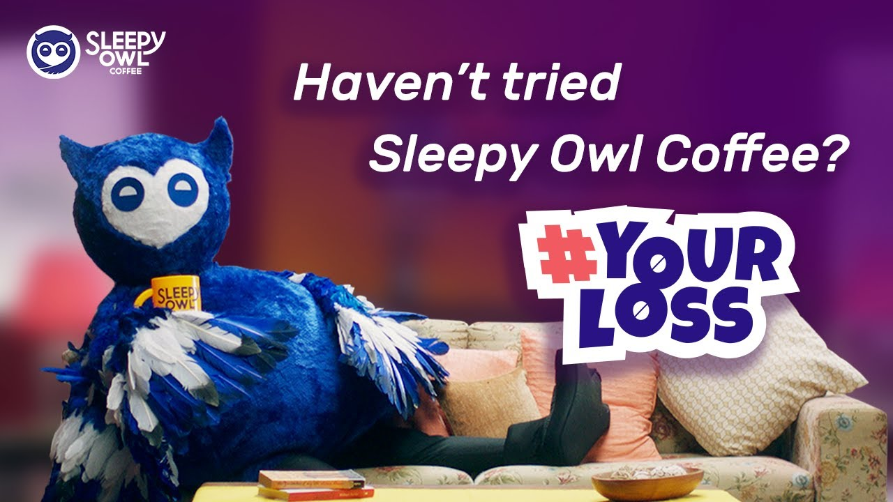
They don’t try to be everywhere, they double down on what works. Instagram and YouTube Shorts are their playgrounds, supported by email and website content.
Snackable, Shareable Content
The content they put out is bite-sized but high-impact. Reels demonstrate how to use products in under 30 seconds. Memes and relatable posts speak directly to the caffeine-dependent millennial, blending humor with product familiarity. And packaging explainers cleverly turn each product into content, making discovery feel effortless.
Letting the Community Speak
What makes their strategy even smarter is their strong user-generated content (UGC) loop. They frequently repost customer unboxings, brewing setups, and aesthetic coffee corners, all seamlessly fitting into their brand palette. This doesn’t just boost credibility, it builds a community around shared rituals and moments.
Less Talk, More Show
Sleepy Owl doesn’t invest much in long-form blogs or text-heavy posts. Instead, they let visuals do the talking. Their approach is simple: be helpful, be human, and let real customers amplify the message. And in a cluttered content world, that clarity stands out.
8. Sales Channels
Sleepy Owl began as a D2C-first brand, and they’ve truly owned that space. Their website is fast, minimalistic, and unmistakably on-brand. From crisp product images to clear, benefit-driven descriptions and easy CTAs, the online experience reflects the same thoughtful simplicity as their packaging.
But their presence isn’t limited to their own store. Sleepy Owl has expanded across major marketplaces like Amazon, Blinkit, and Swiggy Instamart, where they maintain visual and tonal consistency. The product photos, copywriting, and overall look mirror what you’d find on their website, making the transition seamless for customers.
They’ve even entered select offline retailers like Nature’s Basket and Foodhall, where the shelf presence still feels uniquely Sleepy Owl.
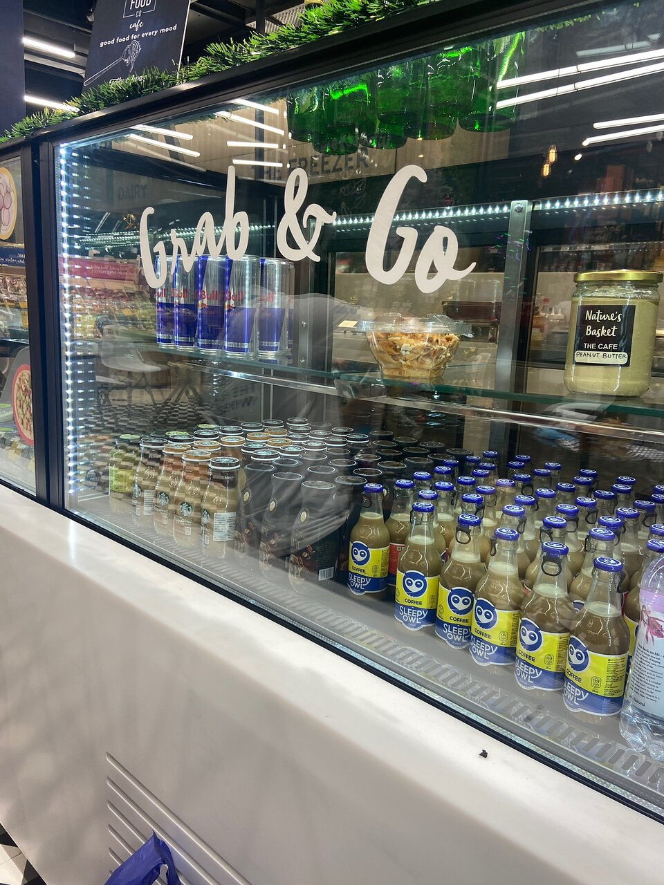
Whether you’re buying online or grabbing a cold brew off a shelf, the brand experience stays cohesive. That kind of consistency builds trust, recognition, and repeat purchase behavior.
What Coffee Brands Can Learn From Sleepy Owl
Sleepy Owl didn’t invent coffee – they reinvented how it fits into modern routines. Their success isn’t built on novelty. It’s built on execution. Here’s what other coffee brands can take away:
- Say More With Less: Sleepy Owl is a name that sparks curiosity and lingers. It communicates late nights, caffeine, and comfort in just two words. Your brand name should tell a story.
- Make Packaging a Sales Tool: Every box, pouch, or bottle does more than hold the product. It educates, attracts, and builds trust. Clear instructions, appealing visuals, and brand storytelling are all baked into the packaging.
- Be Clear > Sound Premium: Sleepy Owl doesn’t try to sound elite or abstract. Their tone is relatable and honest because their customer values clarity over fluff. If your target audience wants convenience, speak their language.
- Design Every Visual Like an Ad: From product shots to UGC reposts, every image sells. Whether on a shelf or a phone screen, the visual experience is aligned, curated, and persuasive.
- Be Religiously Consistent: Their tone, colors, fonts, and voice stay identical across platforms. Whether you’re browsing Instagram, reading an email, or holding a carton, you know it’s Sleepy Owl.
- Know Exactly Who You’re Talking To: They don’t try to convert tea drinkers. They speak directly to their tribe: busy, quality-conscious coffee lovers. That focus shows up in every touchpoint.
Start here. The branding playbook writes itself from there.
Final Thoughts
Sleepy Owl doesn’t just use visuals to decorate. They use them to communicate. Their logo, type, and colors aren’t just beautiful, they’re strategic tools that deliver clarity, comfort, and brand recall in seconds.
If you’re building a coffee brand (or any D2C brand), this is the gold standard: be seen, be remembered, and be consistent.
Want help building your coffee brand’s foundation? Reach out to us today!